Unlock a world of possibilities! Login now and discover the exclusive benefits awaiting you.
- Qlik Community
- :
- All Forums
- :
- QlikView App Dev
- :
- Re: Line Chart with two filled lines and between a...
Options
- Subscribe to RSS Feed
- Mark Topic as New
- Mark Topic as Read
- Float this Topic for Current User
- Bookmark
- Subscribe
- Mute
- Printer Friendly Page
Turn on suggestions
Auto-suggest helps you quickly narrow down your search results by suggesting possible matches as you type.
Showing results for
Contributor II
2019-06-09
07:05 AM
- Mark as New
- Bookmark
- Subscribe
- Mute
- Subscribe to RSS Feed
- Permalink
- Report Inappropriate Content
Line Chart with two filled lines and between a dot line (Growing Up Table)
Hello at all,
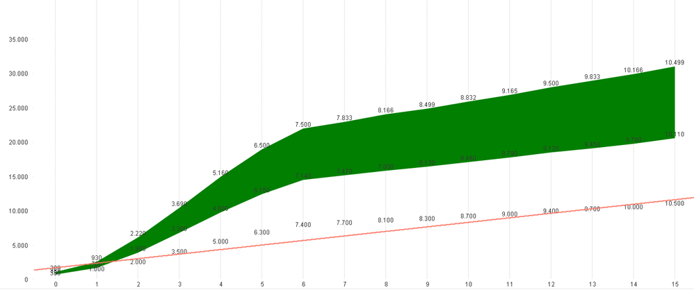
i have the following line chart:
Now i want the red line between the two others. The Problem is, that the red line not going with the y Axis. Can anyone help me what i make wrong?
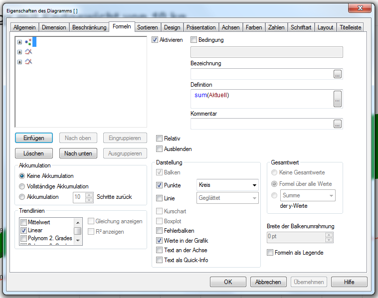
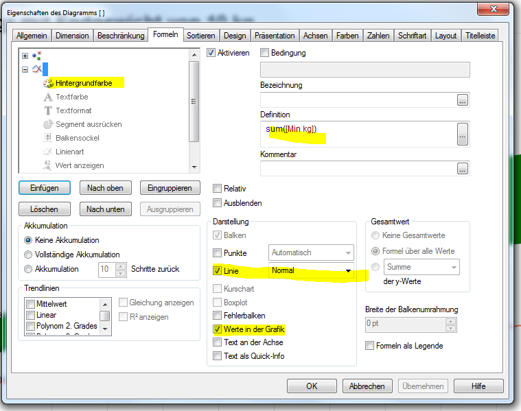
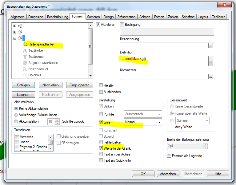
Here are the definition of the lines
formel 1
formel 2
formel 3
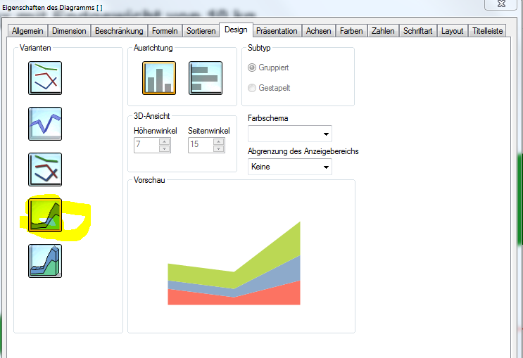
the definition of the design
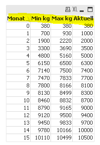
here is the table i want to make a line chart where the value "Aktuell" is between the two filled lines.
In the End i want to make a growing table where you have the Min KG Value and the Max KG Value per Month and the actual kg i want with a dot line. Thanks for helping me.
Best Regards
Daniela
544 Views
1 Reply
Partner Ambassador
2019-06-17
10:34 PM
- Mark as New
- Bookmark
- Subscribe
- Mute
- Subscribe to RSS Feed
- Permalink
- Report Inappropriate Content
Hi Daniela!
Can you please share your app?
Another thing I noticed that you've put Sum([Min kg]) and Sum([Maxkg]) into colour, which seems quite strange
Regards,
Sergey
Can you please share your app?
Another thing I noticed that you've put Sum([Min kg]) and Sum([Maxkg]) into colour, which seems quite strange
Regards,
Sergey
Regards,
Sergey
Sergey
514 Views
