Unlock a world of possibilities! Login now and discover the exclusive benefits awaiting you.
- Qlik Community
- :
- All Forums
- :
- QlikView App Dev
- :
- Line Charts Months vs Years and Dates Vs Months
- Subscribe to RSS Feed
- Mark Topic as New
- Mark Topic as Read
- Float this Topic for Current User
- Bookmark
- Subscribe
- Mute
- Printer Friendly Page
- Mark as New
- Bookmark
- Subscribe
- Mute
- Subscribe to RSS Feed
- Permalink
- Report Inappropriate Content
Line Charts Months vs Years and Dates Vs Months
Hi All,
I have a created the following line chart with from a date with Month(Date) on x axis and Year(Date) on Y axis. and expression as Sum(High)
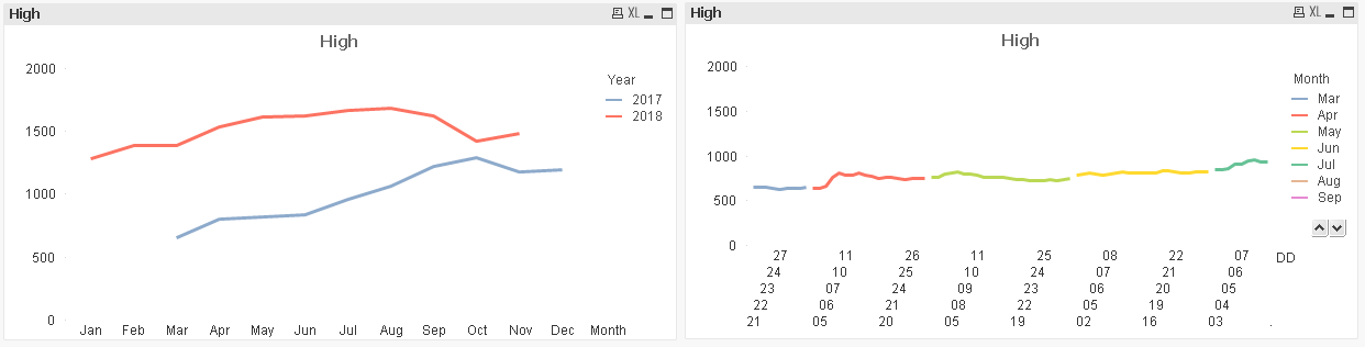
A similar kind of graph I want for Days in a Month vs Months in a Year. But that is spread as show on the right hand side.
Is there a function like Dayinaquarter for Months also, so that can help me fix this.
Thanks in Advance
Ram Marthi
Accepted Solutions
- Mark as New
- Bookmark
- Subscribe
- Mute
- Subscribe to RSS Feed
- Permalink
- Report Inappropriate Content
The Day() function will return the day of the month of a date. Is that what you're looking for? It looks like you're now using the date formatted as DD in the chart on the right. That means it's still the date field that's the dimension on the x-axis. You probably want to change that to the Day field if that exists or Day(Date) if it doesn't.
talk is cheap, supply exceeds demand
- Mark as New
- Bookmark
- Subscribe
- Mute
- Subscribe to RSS Feed
- Permalink
- Report Inappropriate Content
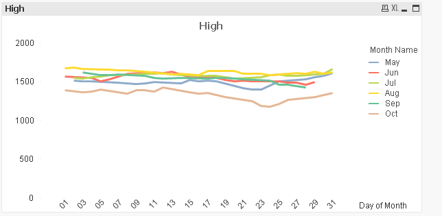
Using the Text of date of Date in the script does the magic.
LOAD Date,
Text( Date( Date, 'DD' ) ) as [Day of Month],
Month( Date ) as [Month Name],
Year(Date) as Year,
And this is how the line chart looks like:

- Mark as New
- Bookmark
- Subscribe
- Mute
- Subscribe to RSS Feed
- Permalink
- Report Inappropriate Content
Yes, Day(Date) also gives the same results I just checked. Thanks for the response.