Unlock a world of possibilities! Login now and discover the exclusive benefits awaiting you.
- Qlik Community
- :
- All Forums
- :
- QlikView App Dev
- :
- Line Graph in Chart
- Subscribe to RSS Feed
- Mark Topic as New
- Mark Topic as Read
- Float this Topic for Current User
- Bookmark
- Subscribe
- Mute
- Printer Friendly Page
- Mark as New
- Bookmark
- Subscribe
- Mute
- Subscribe to RSS Feed
- Permalink
- Report Inappropriate Content
Line Graph in Chart
Hi all,
I want to create a LINE graph. I have the below data.
| Locality | Costs | Period |
| A | 100 | Nov-13 |
| B | 200 | Oct-13 |
| C | 300 | Sep-13 |
| D | 400 | Aug-13 |
| E | 500 | Jul-13 |
| F | 600 | Jun-13 |
I want to see a line graph with "Period" on X-axis and "Locality" on Y-axis. "Costs" should be the LINE on the graph. In other words, I want to see the costs for all localities as LINES, for a particular period. Is that be possible. If yes, Could you please let me know how to do it ?
Thanks
- Tags:
- new_to_qlikview
Accepted Solutions
- Mark as New
- Bookmark
- Subscribe
- Mute
- Subscribe to RSS Feed
- Permalink
- Report Inappropriate Content
Hi Prakash
open a chart object and choose "line chart'
set Period and Locality as dimensions and sum(Costs) as expression
you'll get this
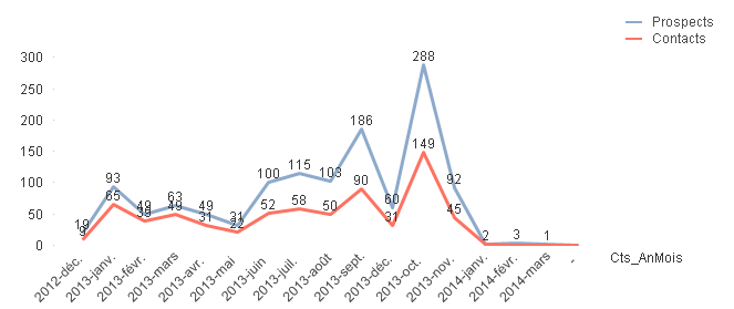
Best regards
Chris
- Mark as New
- Bookmark
- Subscribe
- Mute
- Subscribe to RSS Feed
- Permalink
- Report Inappropriate Content
Hi Prakash
open a chart object and choose "line chart'
set Period and Locality as dimensions and sum(Costs) as expression
you'll get this
Best regards
Chris
- Mark as New
- Bookmark
- Subscribe
- Mute
- Subscribe to RSS Feed
- Permalink
- Report Inappropriate Content
Thanks Christian!
Its working fine.