Unlock a world of possibilities! Login now and discover the exclusive benefits awaiting you.
- Qlik Community
- :
- All Forums
- :
- QlikView App Dev
- :
- Min values in qlikview table
- Subscribe to RSS Feed
- Mark Topic as New
- Mark Topic as Read
- Float this Topic for Current User
- Bookmark
- Subscribe
- Mute
- Printer Friendly Page
- Mark as New
- Bookmark
- Subscribe
- Mute
- Subscribe to RSS Feed
- Permalink
- Report Inappropriate Content
Min values in qlikview table
HI
i have a data like this . I will attach data also
now from that data i want to show that in the past 10 races, the teams who have low Pen will win the races
...
- « Previous Replies
-
- 1
- 2
- Next Replies »
- Mark as New
- Bookmark
- Subscribe
- Mute
- Subscribe to RSS Feed
- Permalink
- Report Inappropriate Content
okay @Kushal_Chawda then how we can convert this data table into a pie or bar chart?
- Mark as New
- Bookmark
- Subscribe
- Mute
- Subscribe to RSS Feed
- Permalink
- Report Inappropriate Content
@capriconuser you won't be able to convert to bar or pie. If convert it won't show anything. Somehow we can able to convert it but it won't show the exact values as in table as it will aggregate the data for individual year.
- Mark as New
- Bookmark
- Subscribe
- Mute
- Subscribe to RSS Feed
- Permalink
- Report Inappropriate Content
@Kushal_Chawda u said i can add Pen column into dimension ... but what is this possible to get values through expression .. like if we do Min or something like that ? actually i want data in graph ..
- Mark as New
- Bookmark
- Subscribe
- Mute
- Subscribe to RSS Feed
- Permalink
- Report Inappropriate Content
try below
Data:
LOAD Year,
     [Race Result],
     Year&chr(10)&Pen as Key,
     Laps,
     Pen,
     Score
FROM
[Book1 (1).xlsx]
(ooxml, embedded labels, table is Sheet1);
Create bar chart with Dimension Key and below expression
sum(Pen)
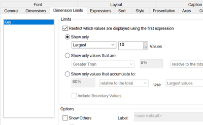
Below are the bar graph settings
Here is the bar chart
- « Previous Replies
-
- 1
- 2
- Next Replies »


