Unlock a world of possibilities! Login now and discover the exclusive benefits awaiting you.
- Qlik Community
- :
- All Forums
- :
- QlikView App Dev
- :
- Re: My chart give wrong color for GP% when i add %...
- Subscribe to RSS Feed
- Mark Topic as New
- Mark Topic as Read
- Float this Topic for Current User
- Bookmark
- Subscribe
- Mute
- Printer Friendly Page
- Mark as New
- Bookmark
- Subscribe
- Mute
- Subscribe to RSS Feed
- Permalink
- Report Inappropriate Content
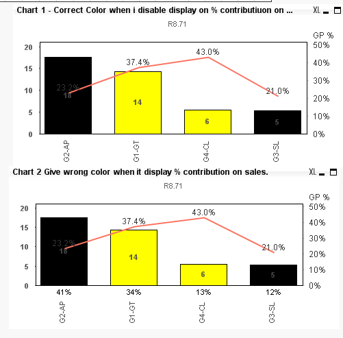
My chart give wrong color for GP% when i add % sales contribution Amount display at X Axis.
Hi All
I have chart 1 which is working fine on GP % traffic light , meaning it give the correct color . But unable to display the % sales contribution Amount on the X Axis.
I also have chart 2 , which is not working on GP% Traffic light , The color wrong , But it can display % sales contribution amount on X Axis.
Can some one tell me how to make chart one able to display correct traffic light on GP% and yet display % sales contribution amount on X axis.
In my next posting i will attach the QV sample.
Paul
- Tags:
- qlikview_scripting
Accepted Solutions
- Mark as New
- Bookmark
- Subscribe
- Mute
- Subscribe to RSS Feed
- Permalink
- Report Inappropriate Content
I see no differences here except the additional label on the axis in the bottom chart. (No changes in color). What am I missing?
- Mark as New
- Bookmark
- Subscribe
- Mute
- Subscribe to RSS Feed
- Permalink
- Report Inappropriate Content
Just so you know, no sample has been attached so far 
- Mark as New
- Bookmark
- Subscribe
- Mute
- Subscribe to RSS Feed
- Permalink
- Report Inappropriate Content
I see no differences here except the additional label on the axis in the bottom chart. (No changes in color). What am I missing?
- Mark as New
- Bookmark
- Subscribe
- Mute
- Subscribe to RSS Feed
- Permalink
- Report Inappropriate Content
Hi Sunny
I know because I am using ver 9 . You must be using ver 11 right ?
Paul
Sent from my iPhone
- Mark as New
- Bookmark
- Subscribe
- Mute
- Subscribe to RSS Feed
- Permalink
- Report Inappropriate Content
I am on v12 now . Why haven't you updated yet?
- Mark as New
- Bookmark
- Subscribe
- Mute
- Subscribe to RSS Feed
- Permalink
- Report Inappropriate Content
Me no Budget to update. It is ok. I use other chart to display sales contribution.
Sent from my iPhone