- Mark as New
- Bookmark
- Subscribe
- Mute
- Subscribe to RSS Feed
- Permalink
- Report Inappropriate Content
Need a Gantt Chart to show daily workload and overlap
Hi,
I'm trying to create a Gantt Chart that can show the activity for a single day as well as identifying the overlaps when a certain limit is hit.
Eg I have some data in Excel that contains arrival time, leave time and duration and i need it to show in a Gantt chart when we hit a certain limit (eg we only have 8 rooms in total available so the 9th person will have to wait until one of the previous 8 leaves).
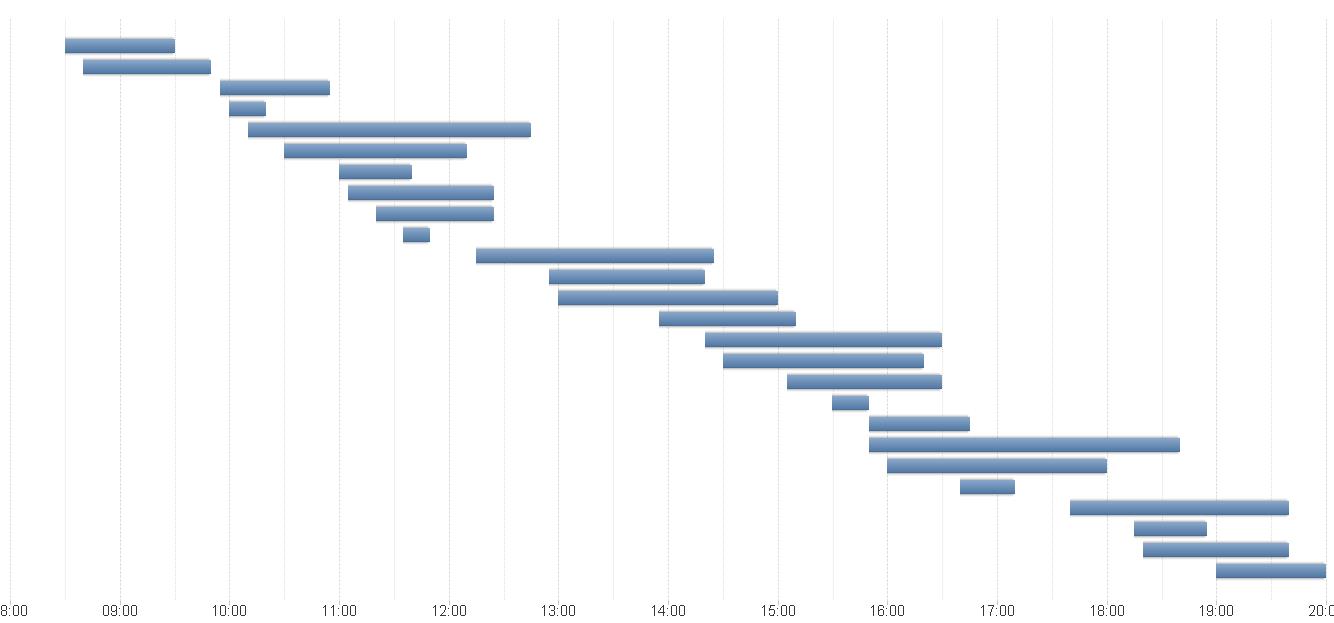
I can manually create something similar in Excel that looks likes this: 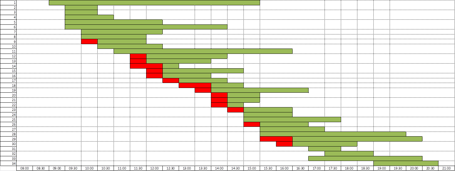
I'd rather be able to use the power of Qlikview to dynamically show different days quickly and identify other elements captured within the data.
Has anyone got any suggestions?
Thanks.
- Mark as New
- Bookmark
- Subscribe
- Mute
- Subscribe to RSS Feed
- Permalink
- Report Inappropriate Content
have a look at the attached files
hope this helps
- Mark as New
- Bookmark
- Subscribe
- Mute
- Subscribe to RSS Feed
- Permalink
- Report Inappropriate Content
Thanks for this, i'll take a proper look but initial view is that its for more day to day gantt chart where as i need to be able to show a day split up, so having it divided by hours rather than days.
Does that make sense?
- Mark as New
- Bookmark
- Subscribe
- Mute
- Subscribe to RSS Feed
- Permalink
- Report Inappropriate Content
There are lo of blogs in the community you can search them and use them
- Mark as New
- Bookmark
- Subscribe
- Mute
- Subscribe to RSS Feed
- Permalink
- Report Inappropriate Content
Following are some links for related topics:
QlikView Addict: Gantt Charts in QlikView
One Qlik at a Time: Qlikview Charts with Colours
Thanks,
- Mark as New
- Bookmark
- Subscribe
- Mute
- Subscribe to RSS Feed
- Permalink
- Report Inappropriate Content
thanks to the guys who have referred me to the Recipe for a Gantt chart link. I had already looked at that but i still cant get it to show what i've described above.
initally i need it to show me the elements over a 12 hour period (rather than over a large sections of days) but also to highlight the overlaps.
I've gone through the different links but cant see how to alter it to show me the hourly (and minutes) duration of the various elements. Could just be that i've gone 'data blind' from looking at the same thing for so long.
Happy for anybody to talk me through it step by step.
Thanks in advance.
- Mark as New
- Bookmark
- Subscribe
- Mute
- Subscribe to RSS Feed
- Permalink
- Report Inappropriate Content
So I've managed to create a Gantt Chart following a combination of the instructions and i now have this:
So far, so good.
Two things i need to achieve now -
Colour of the bar needs to be green, unless we are in a situation whereby we have 8 elements in the same time section when in which case it needs to be red.
I'm going to need to add a third colour in there at some point too to show a variation within the individual process but i want to get this bit working properly first.
Any ideas?
Thanks.
- Mark as New
- Bookmark
- Subscribe
- Mute
- Subscribe to RSS Feed
- Permalink
- Report Inappropriate Content
Been able to change the colour of the bars to green (By going into 'Expressions', clicking the little + sign on the element and then adding the 'Definition' "RGB(38,247,94)"
Now just need to work out how to highlight those sections of the bars that need to be red due to the status of the previous bars.