Unlock a world of possibilities! Login now and discover the exclusive benefits awaiting you.
- Qlik Community
- :
- All Forums
- :
- QlikView App Dev
- :
- Re: Need help on creating Y Axis scale in Grid Cha...
- Subscribe to RSS Feed
- Mark Topic as New
- Mark Topic as Read
- Float this Topic for Current User
- Bookmark
- Subscribe
- Mute
- Printer Friendly Page
- Mark as New
- Bookmark
- Subscribe
- Mute
- Subscribe to RSS Feed
- Permalink
- Report Inappropriate Content
Need help on creating Y Axis scale in Grid Chart
Hi All,
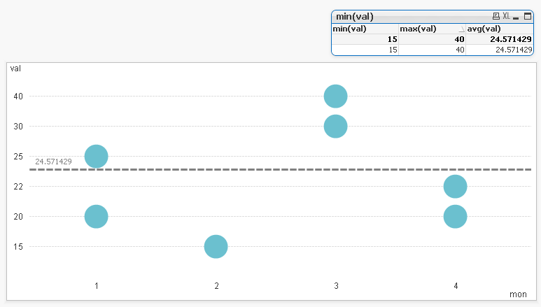
I need help on creating a Y -Axis scale in Grid chart in qlikview. Basically My requirement is to display month wise unit price for a particular Item Code.
I have attached the screenshot. I need to display the average line in this grid chart. But I am not able to do that as its not allowing me to fix the scale for Unit price.
Any ideas/Suggestions?
- Mark as New
- Bookmark
- Subscribe
- Mute
- Subscribe to RSS Feed
- Permalink
- Report Inappropriate Content
Maybe use a double scale chart can help you.
- Mark as New
- Bookmark
- Subscribe
- Mute
- Subscribe to RSS Feed
- Permalink
- Report Inappropriate Content
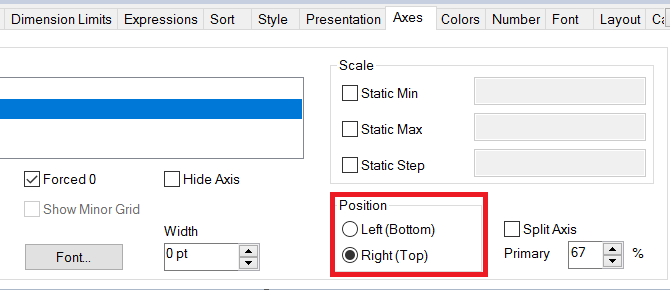
Hello!
If you restricted with grid chart, so you'll have to convert your months from text to numbers and use some hints to calculate the average like:
avg(val)/max(val)*max(mon)
,where "mon" is your months converted to 1,2,3 and so on, and "val" is the value per month.
Why that? PFA below.