Unlock a world of possibilities! Login now and discover the exclusive benefits awaiting you.
- Qlik Community
- :
- All Forums
- :
- QlikView App Dev
- :
- Re: Negative values are showing on the same side w...
- Subscribe to RSS Feed
- Mark Topic as New
- Mark Topic as Read
- Float this Topic for Current User
- Bookmark
- Subscribe
- Mute
- Printer Friendly Page
- Mark as New
- Bookmark
- Subscribe
- Mute
- Subscribe to RSS Feed
- Permalink
- Report Inappropriate Content
Negative values are showing on the same side with Positive values on Bar chart
Hi Guys,
I have a bar chart with negative and positive values.
Not sure why one of the values (-1000) is showing on the same side with the positive values!
Attached is a sample of the file
I have tested the value to make sure it is negative value by adding a text box and makeing some calculations. the value is negative but not sure why it is showing on the positive side!
I appreciate any help and suggestions.
- Mark as New
- Bookmark
- Subscribe
- Mute
- Subscribe to RSS Feed
- Permalink
- Report Inappropriate Content
i think you are wrong , it is showing you negative values,
see atach.
Regards
- Mark as New
- Bookmark
- Subscribe
- Mute
- Subscribe to RSS Feed
- Permalink
- Report Inappropriate Content
Hi,
Thanks for the reply, I have noticed on your sample that the value shows correctly on the left side. but if you try to make the chart smaller it switches to the other side. I don't understand why 
it is so weird!
Thxs,
Alec
- Mark as New
- Bookmark
- Subscribe
- Mute
- Subscribe to RSS Feed
- Permalink
- Report Inappropriate Content
I don't see it. I'm using QV11 SR2 update2. The text with the negative value -1000 is showing as (1000) on the left. The bar is so small it's impossible to tell if it is on the left or the right. If I select a range from -1000 to 2000 then it's clearly on the left.
talk is cheap, supply exceeds demand
- Mark as New
- Bookmark
- Subscribe
- Mute
- Subscribe to RSS Feed
- Permalink
- Report Inappropriate Content
Hi,
Thxs for the reply1
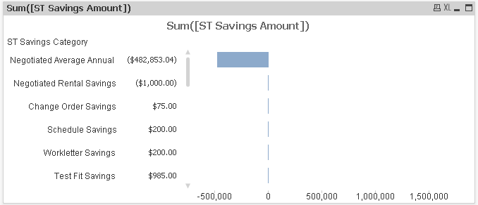
I have attached an image on how the -1000 is showing to the right while it should show to the left.
I have QV V10 SR 3 and QV V 11 SR1 and I have the same situation on both.
If I make the chart wider the value of - 1000 switch to the right direction.
What I cannot understand is that there is a higher negative value under it and it is always showing correctly on the left side.
Thxs,
- Mark as New
- Bookmark
- Subscribe
- Mute
- Subscribe to RSS Feed
- Permalink
- Report Inappropriate Content
And I am talking about the value on data point . the value is showing on the right side instead of the left
- Mark as New
- Bookmark
- Subscribe
- Mute
- Subscribe to RSS Feed
- Permalink
- Report Inappropriate Content
Seems like a bug to me.
If you enlarge the width of the chart, you'll see the value on data point jumping around while moving the mouse (at least I do.
If you then remove the largest three positive bars from your selection, the value is shown to the left (again, at least at my side).
Shrinkening the width again brings it back to the right.
Seems like a mislead algorithm QV uses here to tell if it should show the value on data point to the left or right.
- Mark as New
- Bookmark
- Subscribe
- Mute
- Subscribe to RSS Feed
- Permalink
- Report Inappropriate Content
That's exactly what I am experiencing! It seems to be a bug!
I wish I can find away around it.
Any Suggestions?
Thxs,
Alec
- Mark as New
- Bookmark
- Subscribe
- Mute
- Subscribe to RSS Feed
- Permalink
- Report Inappropriate Content
Upgrade!
Or use Text on Axis instead of Values on Data Points. That looks better anyway imho.
It's also a better solution from a cognitive processing point of view. Less scanning for information and no 'mental' distortion of the length of the bars. The mind tends to some degree to include the length of the text in the comparison of bars by length.
talk is cheap, supply exceeds demand