Unlock a world of possibilities! Login now and discover the exclusive benefits awaiting you.
- Qlik Community
- :
- All Forums
- :
- QlikView
- :
- New to Clickview - Need to display backlog graph
- Subscribe to RSS Feed
- Mark Topic as New
- Mark Topic as Read
- Float this Topic for Current User
- Bookmark
- Subscribe
- Mute
- Printer Friendly Page
- Mark as New
- Bookmark
- Subscribe
- Mute
- Subscribe to RSS Feed
- Permalink
- Report Inappropriate Content
New to Clickview - Need to display backlog graph
Hello all,
I am new to QlickView and am trying to display a graph based on a backlog of work orders over time. I have an Oracle SQL statement that selects the data but cannot get the same result from Qlickview. I really dont grasp the concept of sets and expressions and how to use them properly. I can plot either Created or Completed on seperate graphs over a period of time, but cant figgure how to combine and end up with the proper result set.
Here is what I was trying to do. Any ideas/ suggestions? Is this possible in Qlickview?
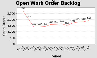
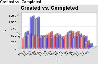
Below is the SQL to select data from Oracle. It displays the backlog for the past 12 months, from this I can generate the graphs above. (I'm not an expert in SQL, its slow but does work). Note I must read the whole data set to compute the opening backlog in the last 12 months.
select * from
(SELECT "Period",
"Created" , "Completed",
Sum("Backlog") OVER(order by "Period" RANGE BETWEEN UNBOUNDED PRECEDING AND CURRENT ROW) AS "Backlog"
from
(
select "Period",
"Created" , "Completed",
"Created" - "Completed" as "Backlog"
from
(select
"Period",
"Created",
(Select count(*) from work_orders where to_char("Actual Finish",'YY-MM') = "Period" and "Stat" in('Complete')) as "Completed"
from (
select
to_char( "Created on",'YY-MM') As "Period",
sum(1) as "Created"
from work_orders
group by to_char( sap."Created on",'YY-MM')
order by to_char( sap."Created on",'YY-MM')
)
))
) where "Period" >= to_char(sysdate -366,'YY-MM')
Regards,
Robert