Unlock a world of possibilities! Login now and discover the exclusive benefits awaiting you.
- Qlik Community
- :
- All Forums
- :
- QlikView App Dev
- :
- Normalization in Radar Chart.
- Subscribe to RSS Feed
- Mark Topic as New
- Mark Topic as Read
- Float this Topic for Current User
- Bookmark
- Subscribe
- Mute
- Printer Friendly Page
- Mark as New
- Bookmark
- Subscribe
- Mute
- Subscribe to RSS Feed
- Permalink
- Report Inappropriate Content
Normalization in Radar Chart.
Hi everyone,
The case is:
I had a table
| ID | Product | field1 | field2 | field3 | field4 |
|---|---|---|---|---|---|
I need to represent it as:
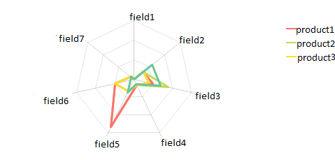
One curve shows values of different fields for that product.(lets assume there is only one entry for one product)
To achieve this, I got this far,
I made a Cross Table :
| ID | Product | FieldName | FieldValue |
|---|---|---|---|
In Radar Chart, I put Product and FieldName as Dimensions and Field Value Expression.
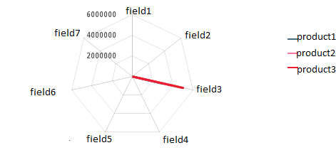
The problem is that all the fields have values of different ranges.(Some are in millions while others are in percentage.)
Without cross table I can simply use expression field2/max(field2)
But, after conversion to cross table, I need to aggregate by FieldName and then get maximum to put in place of max(field2)
I can't find a way to do this.
Need Help!
Thanks.
- Mark as New
- Bookmark
- Subscribe
- Mute
- Subscribe to RSS Feed
- Permalink
- Report Inappropriate Content
I'm not sure what do you want to do but the radar-chart is only very few cases a senseful visualization. Therefore I think you should consider to use another chart-type.
- Marcus