Unlock a world of possibilities! Login now and discover the exclusive benefits awaiting you.
- Qlik Community
- :
- All Forums
- :
- QlikView App Dev
- :
- Re: Painting values on data points
- Subscribe to RSS Feed
- Mark Topic as New
- Mark Topic as Read
- Float this Topic for Current User
- Bookmark
- Subscribe
- Mute
- Printer Friendly Page
- Mark as New
- Bookmark
- Subscribe
- Mute
- Subscribe to RSS Feed
- Permalink
- Report Inappropriate Content
Painting values on data points
hello, everyone!
I just want to know, if is possible to paint the value area in the chart as we could do in excel:
I've been trying to do that all day long.
Example:
- « Previous Replies
-
- 1
- 2
- Next Replies »
Accepted Solutions
- Mark as New
- Bookmark
- Subscribe
- Mute
- Subscribe to RSS Feed
- Permalink
- Report Inappropriate Content
You can increase the distance between your bars, just go to the Presentation nad in the Bar Settings, increase the Bar Distance ![]()
- Mark as New
- Bookmark
- Subscribe
- Mute
- Subscribe to RSS Feed
- Permalink
- Report Inappropriate Content
Hi Luiz,
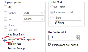
Have you tried to check

Regards,
MB
- Mark as New
- Bookmark
- Subscribe
- Mute
- Subscribe to RSS Feed
- Permalink
- Report Inappropriate Content
Please share your qvw or your Excel file so that we make a similar solution ![]()
- Mark as New
- Bookmark
- Subscribe
- Mute
- Subscribe to RSS Feed
- Permalink
- Report Inappropriate Content
Find this useful vídeo:
- Mark as New
- Bookmark
- Subscribe
- Mute
- Subscribe to RSS Feed
- Permalink
- Report Inappropriate Content
Miguel, first of all, thanks for reply me!
I got to give values on data points, however, I can't paint it. (Put that gray board around the values)
I want to put that, because I have two lines and sometimes, they intersect, overlapping the datas.
Do you have any idea?
Kind Regards, Luiz
- Mark as New
- Bookmark
- Subscribe
- Mute
- Subscribe to RSS Feed
- Permalink
- Report Inappropriate Content
The last expression used as line chirt in the combochart must be something like this:
="Blue"+"Red"
In there you must check the "Value on Data Point".
Hope it helps you ![]()
- Mark as New
- Bookmark
- Subscribe
- Mute
- Subscribe to RSS Feed
- Permalink
- Report Inappropriate Content
You can increase the distance between your bars, just go to the Presentation nad in the Bar Settings, increase the Bar Distance ![]()
- Mark as New
- Bookmark
- Subscribe
- Mute
- Subscribe to RSS Feed
- Permalink
- Report Inappropriate Content
Or you can make them vertically so that the values don't overlap ![]() . Can't see any better way to solve your problema...
. Can't see any better way to solve your problema...
- Mark as New
- Bookmark
- Subscribe
- Mute
- Subscribe to RSS Feed
- Permalink
- Report Inappropriate Content
Hello Michael, I think I was not very clear (Again, thanks for the help).
I would like to paint the data, have a combined bar graph and lines. And I would like to paint the data labels (which are already inserted in the lines) because the lines cross and the data end up overlapping each other. I can insert the labels but not pintalos, giving them the gray background.
Thanks for the help, carefully. Luiz
Olá Miguel, penso que não fui muito claro (Mais uma vez, obrigado pela ajuda).
Gostaria de pintar os dados, tenho um gráfico combinado de barras e linhas. E gostaria de pintar os rótulos de dados (Que já estão inseridos nas linhas), pois as linhas se cruzam e os dados acabam sobrepondo uns aos outros. Consigo inserir os rótulos, mas não pintalos, dar à eles o fundo cinza.
Obrigado pela ajuda, atenciosamente. Luiz
Note: Edited by moderator to include translation as a courtesy.
- Mark as New
- Bookmark
- Subscribe
- Mute
- Subscribe to RSS Feed
- Permalink
- Report Inappropriate Content
I think you can't do it the same in QlikView. If the values are intersecting you can adjust the data point values by plotting the values inside the bars
- « Previous Replies
-
- 1
- 2
- Next Replies »