Unlock a world of possibilities! Login now and discover the exclusive benefits awaiting you.
- Qlik Community
- :
- All Forums
- :
- QlikView App Dev
- :
- Re: Pie chart configuration
- Subscribe to RSS Feed
- Mark Topic as New
- Mark Topic as Read
- Float this Topic for Current User
- Bookmark
- Subscribe
- Mute
- Printer Friendly Page
- Mark as New
- Bookmark
- Subscribe
- Mute
- Subscribe to RSS Feed
- Permalink
- Report Inappropriate Content
Pie chart configuration
Hi,
I have a pie chart that looks like this
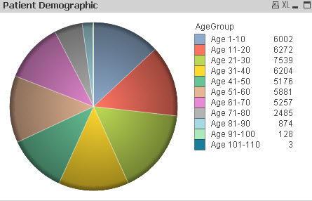
The number next to the AgeGroup is the number of patients. Questions I have are:
Q1 - How do I include a header to say "NumOfPat"?
Q2 - Is it possible to show the percentage on the pie chart for each age group? For example, blue is about 18%, green
is about 20%.
Thanks!!
- « Previous Replies
-
- 1
- 2
- Next Replies »
- Mark as New
- Bookmark
- Subscribe
- Mute
- Subscribe to RSS Feed
- Permalink
- Report Inappropriate Content
Gotcha... I don't know of a real way, but you could simply use "Text in Chart" to fake it. Just create the text box and position it with the Control-Shift trick.
- Mark as New
- Bookmark
- Subscribe
- Mute
- Subscribe to RSS Feed
- Permalink
- Report Inappropriate Content
Thanks Michael. Let me play around with it and the CTRL+SHIFT trick. I don't know what it is yet but certainly will be trying to click & press to see if I can get close to what I want.
- Mark as New
- Bookmark
- Subscribe
- Mute
- Subscribe to RSS Feed
- Permalink
- Report Inappropriate Content
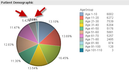
I haven't figured it out how to fix the lowest 3 data point labels yet.
Anyone know of a trick so I can see the percentages clearly? See the red arrows.
- Mark as New
- Bookmark
- Subscribe
- Mute
- Subscribe to RSS Feed
- Permalink
- Report Inappropriate Content
Do they really have to have a Pie Chart? It would be much clearer and cleaner with a horizontal bar chart.
mike
- Mark as New
- Bookmark
- Subscribe
- Mute
- Subscribe to RSS Feed
- Permalink
- Report Inappropriate Content
I did think about whether the lowest 3 data points should be included or not as they aren't playing an
important role in terms of patient targeting. Just thought of something. Maybe I can group the lowest 3 into
"Other" and show this on the pie chart. Let see how it comes out. I will explore the horizontal bar chart as well.
- Mark as New
- Bookmark
- Subscribe
- Mute
- Subscribe to RSS Feed
- Permalink
- Report Inappropriate Content
I think I'm pretty satisfied with this layout now.
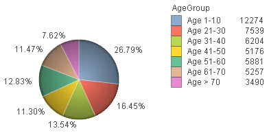
One last thing I need to do is to add the header.
Thanks for everyone's help.
- Mark as New
- Bookmark
- Subscribe
- Mute
- Subscribe to RSS Feed
- Permalink
- Report Inappropriate Content
Try the 'Text in Chart', it's pretty handy.
mike
- Mark as New
- Bookmark
- Subscribe
- Mute
- Subscribe to RSS Feed
- Permalink
- Report Inappropriate Content
For Q1, Where you want to add the name?
Like Text in chart from presentation tab and then use top right end. Try luck
- Mark as New
- Bookmark
- Subscribe
- Mute
- Subscribe to RSS Feed
- Permalink
- Report Inappropriate Content
Hi
With that many values on a pie chart I would suggest either as Michael said use dimension limits to combine the lower values as Others or why not use a combination chart to plot the values as bars and the percentage as a line?
- Mark as New
- Bookmark
- Subscribe
- Mute
- Subscribe to RSS Feed
- Permalink
- Report Inappropriate Content
Hi,
Go to Presentation tab> Text in Chart > Align that text box accordingly using CTRL+Shift
Hope it helps!!
- « Previous Replies
-
- 1
- 2
- Next Replies »