Unlock a world of possibilities! Login now and discover the exclusive benefits awaiting you.
- Qlik Community
- :
- All Forums
- :
- QlikView App Dev
- :
- Re: Pivot RangeSum() -> Line Chart Equivalent
- Subscribe to RSS Feed
- Mark Topic as New
- Mark Topic as Read
- Float this Topic for Current User
- Bookmark
- Subscribe
- Mute
- Printer Friendly Page
- Mark as New
- Bookmark
- Subscribe
- Mute
- Subscribe to RSS Feed
- Permalink
- Report Inappropriate Content
Pivot RangeSum() -> Line Chart Equivalent
A colleague and I are a little stumped with creating a line chart equivalent of a pivot table (for one of the measures).
Attached is the pivot table and a line chart that approximates what we are looking for - if we can get each line to match the yellow % measure for each year, it would exactly what we are looking for.
We tried a number of different ways, unsuccessfully...
Any help with this really appreciated!
- Tags:
- new_to_qlikview
- « Previous Replies
-
- 1
- 2
- Next Replies »
- Mark as New
- Bookmark
- Subscribe
- Mute
- Subscribe to RSS Feed
- Permalink
- Report Inappropriate Content
Right, that's because the MOB column is a calculated dimension
=if(MOB=0,1,MOB)
while the advanced aggregation dimension MOB is not and can't be. There is a conflict because my expression can't decide if it needs to calculate for MOB 0 or MOB 1.
If this calculated dimension is needed, it would be best to calculate a MOBNEW field in the script doing the mapping of policies.
- Mark as New
- Bookmark
- Subscribe
- Mute
- Subscribe to RSS Feed
- Permalink
- Report Inappropriate Content
I just reached a similar conclusion  . I just found out that Calculated dimension is throwing things off.
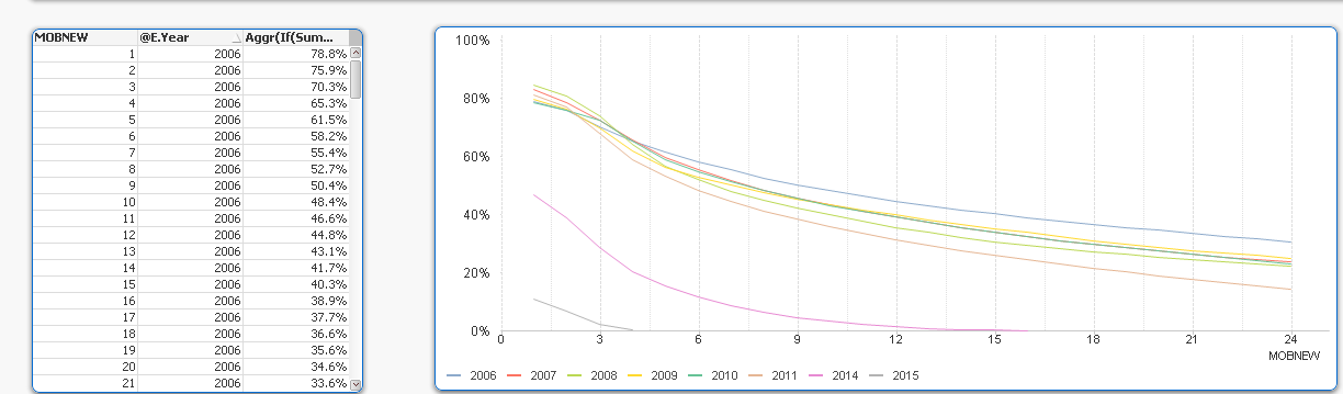
swuehl you are legend my friend. I was able to fix the percentages to match the above pivot table and show 1 with your suggestion of creating MOBNEW
Expression:
Aggr(If(Sum ({$<MOBNEW={">=0<=24"}, @E.Year={">=2006"}>}[# de Poliza]) > 0,
1-RangeSum(Above(Sum ({$<@E.Year={">=2006"}>}[# de Poliza])/Sum(TOTAL <@E.Year> {$<@E.Year={">=2006"}>} [# de Poliza]), 0, RowNo()))), @E.Year, MOBNEW)
Output
- Mark as New
- Bookmark
- Subscribe
- Mute
- Subscribe to RSS Feed
- Permalink
- Report Inappropriate Content
Guys,
This is awesome!!! I will check it out later when I get a chance and mark thread answered.
Thanks so much for your dedication. Really appreciated it!
John
- Mark as New
- Bookmark
- Subscribe
- Mute
- Subscribe to RSS Feed
- Permalink
- Report Inappropriate Content
Just take care in your production environment, that MOB field values have the correct load order, like you want to show in the line chart, numeric ascending. Advanced aggregation dimension values are always sorted by load order.
In your sample files attached, this was already the case.
- Mark as New
- Bookmark
- Subscribe
- Mute
- Subscribe to RSS Feed
- Permalink
- Report Inappropriate Content
This is what was confusing that how did it take the order we wanted. Now I understand how it did.
- Mark as New
- Bookmark
- Subscribe
- Mute
- Subscribe to RSS Feed
- Permalink
- Report Inappropriate Content
Thanks again guys. Nice work!!!
- « Previous Replies
-
- 1
- 2
- Next Replies »