Unlock a world of possibilities! Login now and discover the exclusive benefits awaiting you.
- Qlik Community
- :
- All Forums
- :
- QlikView App Dev
- :
- Re: Pivottabel: colored visualisation of different...
- Subscribe to RSS Feed
- Mark Topic as New
- Mark Topic as Read
- Float this Topic for Current User
- Bookmark
- Subscribe
- Mute
- Printer Friendly Page
- Mark as New
- Bookmark
- Subscribe
- Mute
- Subscribe to RSS Feed
- Permalink
- Report Inappropriate Content
Pivottabel: colored visualisation of different options
Dear experts,
I need your help in QlikView :
I created a pivottable with following column:
- Tolerance - is defined in the excel
- IstSum - working fine (a long formel)
- SollSum - woriking fine (a long formel)
- Evaluation - Doesn't work
In the last column "Evaluation" I have to visualize the result with color and text:
if IstSum > SollSum*(1+Tolerance/100) --> red color (text:too high)
if IstSum < SollSum*(1-Tolerance/100) --> orange color (and text: too few)
if IstSum between SollSum*(1+Tolerance/100) and SollSum*(1-Tolerance/100) --> green (text: im Range)
It seems to be very easy, but I don't know where I can define these three formulas.
I created two variable: tolerance_over (Toleranz_oberhalb) and tolerance_few (Toleranz_unterhalb).
I use these variables in "Visualization", but I cannot use this formulas for "normal"--> "im Range". And these formulas refer to "formulas" and here I don't know, how I can insert 3 formulas.
How can I resolve this problem ? Are there any other alternative (maybe over the "picture")?
Thank you and kind regards,
André
Accepted Solutions
- Mark as New
- Bookmark
- Subscribe
- Mute
- Subscribe to RSS Feed
- Permalink
- Report Inappropriate Content
I'm not sure if it will be possible with the options from tab "Visualisierungen" but it should work with a color-expression on those expression - here you find an example and further possibilities for Colors in charts.
- Marcus
- Mark as New
- Bookmark
- Subscribe
- Mute
- Subscribe to RSS Feed
- Permalink
- Report Inappropriate Content
Can you post a small qlikview document that illustrates the problem?
talk is cheap, supply exceeds demand
- Mark as New
- Bookmark
- Subscribe
- Mute
- Subscribe to RSS Feed
- Permalink
- Report Inappropriate Content
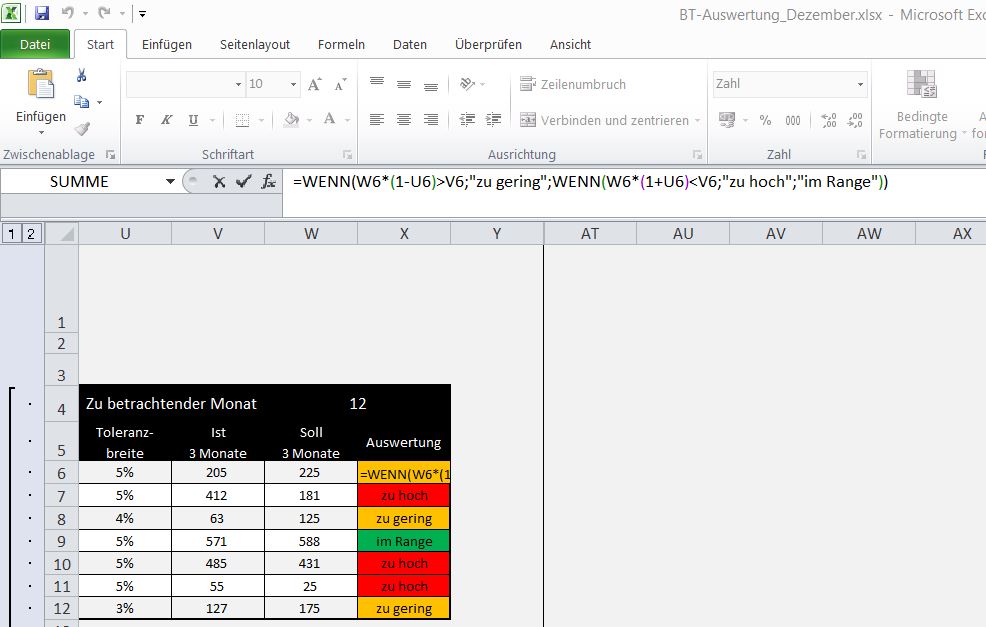
Hello Gysbert,
in the attachment you will find screenshot of the excel-sheet with formulas, how it has to be in qlikview.
Column "U", "V", "W" are working in QlikView.
I need to develop column "X".
I hope it helps to understand my problem.
Kind regards,
- Mark as New
- Bookmark
- Subscribe
- Mute
- Subscribe to RSS Feed
- Permalink
- Report Inappropriate Content
- Mark as New
- Bookmark
- Subscribe
- Mute
- Subscribe to RSS Feed
- Permalink
- Report Inappropriate Content
I'm not sure if it will be possible with the options from tab "Visualisierungen" but it should work with a color-expression on those expression - here you find an example and further possibilities for Colors in charts.
- Marcus
- Mark as New
- Bookmark
- Subscribe
- Mute
- Subscribe to RSS Feed
- Permalink
- Report Inappropriate Content
Thank you, it helped me !
it works in this combination:
Color-value in color-expression and text in definition
In the color-expression I have:
if ($(Bestellung_Plan_Std)*((1-Toleranz)>Sum(Std)), Yellow(),
if ($(Bestellung_Plan_Std)*((1+Toleranz)<Sum(Std)),Red(),
Green()))
and in the definition I valuate a text:
if ($(Bestellung_Plan_Std)*((1-Toleranz)>Sum(Std)), 'zu gering' ,
if ($(Bestellung_Plan_Std)*((1+Toleranz)<Sum(Std)), 'zu hoch',
'im Range'))