Unlock a world of possibilities! Login now and discover the exclusive benefits awaiting you.
- Qlik Community
- :
- All Forums
- :
- QlikView App Dev
- :
- Placing labels on lines in line chart
- Subscribe to RSS Feed
- Mark Topic as New
- Mark Topic as Read
- Float this Topic for Current User
- Bookmark
- Subscribe
- Mute
- Printer Friendly Page
- Mark as New
- Bookmark
- Subscribe
- Mute
- Subscribe to RSS Feed
- Permalink
- Report Inappropriate Content
Placing labels on lines in line chart
I'm following instructions from Qlikview for Developers Cookbooks on how to replace the legend in a line chart with labels on each line.
Here is the script to load the data:
[Line Chart]:
CrossTable(Country,Sale)
LOAD * Inline [
Date, USA, UK, Japan, Germany
2013-01-01,123,100,80,40
2013-02-01,134,111,75,50
2013-03-01,155,95,70,60
2013-04-01,165,85,88,50
2013-05-01,154,125,90,70
2013-06-01,133,110,75,99
];
The line chart consists of two dimension: Date and Country
I use the following expression:
Dual(
if(Date = Max(total Date), Country,''),
Sum(Sale)
)
Here is the screenshot of the chart that I get:
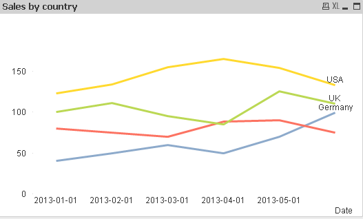
As you can see I'm missing Japan.
If you have a look at the data, the max Sales for japan for the 2nd and 6th of the month is 75, I think this is why it's not showing as a label. If I change one of these dates for 76 then I get all the lables. But in the book, the author has 75 as a max Sales twice and his chart works.
Can anyone suggest why it does not work for me?
Thank you
- Mark as New
- Bookmark
- Subscribe
- Mute
- Subscribe to RSS Feed
- Permalink
- Report Inappropriate Content
I believe this technique is sensitive to the available display space. If you make the chart taller, does Japan appear?
-Rob
- Mark as New
- Bookmark
- Subscribe
- Mute
- Subscribe to RSS Feed
- Permalink
- Report Inappropriate Content
no that does't change anything. If I change the number from 75 to 76 then Japan appears at all sizes