Unlock a world of possibilities! Login now and discover the exclusive benefits awaiting you.
- Qlik Community
- :
- All Forums
- :
- QlikView App Dev
- :
- Re: Please, urgent help needed , How to manage mul...
Options
- Subscribe to RSS Feed
- Mark Topic as New
- Mark Topic as Read
- Float this Topic for Current User
- Bookmark
- Subscribe
- Mute
- Printer Friendly Page
Turn on suggestions
Auto-suggest helps you quickly narrow down your search results by suggesting possible matches as you type.
Showing results for
Not applicable
2013-01-31
01:06 AM
- Mark as New
- Bookmark
- Subscribe
- Mute
- Subscribe to RSS Feed
- Permalink
- Report Inappropriate Content
Please, urgent help needed , How to manage multiple header rows of excel in QlikView ?
As i am new to Qlikview, Please help me to resolve the below question asap.
Excel file is as given below.
| Incurred Quarter | 2009Q1 | 2009Q4 | % Change | |||
| Claim Resubmit Reason | Number of Claims | Average Days to Payment | Number of Claims | Average Days to Payment | Number of Claims | Average Days to Payment |
| Damaged | 1325 | 11.13 | 1370 | 12.42 | 3.4% | 11.6% |
| Cannot Read | 487 | 15.64 | 513 | 16.38 | 5.3% | 4.7% |
| Incorrect Information | 1002 | 12.77 | 1093 | 13.61 | 9.1% | 6.6% |
| Benefit Issue | 1704 | 12.71 | 1879 | 11.71 | 10.3% | -7.9% |
| Provider Issue | 764 | 44.96 | 1441 | 8.05 | 88.6% | -82.1% |
| Summary | 5282 | 15.18 | 6296 | 11.86 | 19.2% | -21.9% |
And the dashboard should be as given below in Qlikview. I should get both graph and table data in a single qlikview sheet. Please find the attached files.
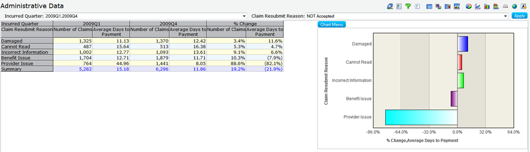
Thanks in advance. Appreciate your response.
2,980 Views
- « Previous Replies
-
- 1
- 2
- Next Replies »
11 Replies
Contributor II
2013-01-31
05:14 AM
- Mark as New
- Bookmark
- Subscribe
- Mute
- Subscribe to RSS Feed
- Permalink
- Report Inappropriate Content
Hi Prajeesh,
There are 3 placed you should make changes, they are as follows:
500 Views
Not applicable
2013-01-31
06:15 AM
Author
- Mark as New
- Bookmark
- Subscribe
- Mute
- Subscribe to RSS Feed
- Permalink
- Report Inappropriate Content
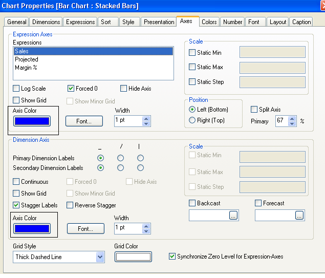
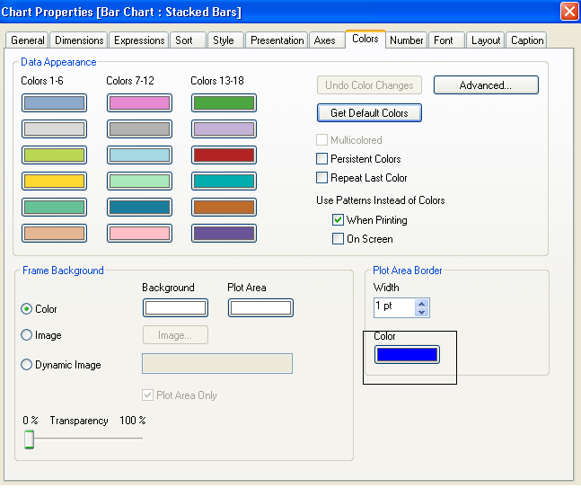
Thanks Surender. But "Plot Area Border" in colors tab is in disabled state. I am using Bar chart. Any idea how can enable it and do the necessary changes as you mentioned?
500 Views
- « Previous Replies
-
- 1
- 2
- Next Replies »