Unlock a world of possibilities! Login now and discover the exclusive benefits awaiting you.
- Qlik Community
- :
- All Forums
- :
- QlikView App Dev
- :
- Re: Preference of overlapping bar chart
- Subscribe to RSS Feed
- Mark Topic as New
- Mark Topic as Read
- Float this Topic for Current User
- Bookmark
- Subscribe
- Mute
- Printer Friendly Page
- Mark as New
- Bookmark
- Subscribe
- Mute
- Subscribe to RSS Feed
- Permalink
- Report Inappropriate Content
Preference of overlapping bar chart
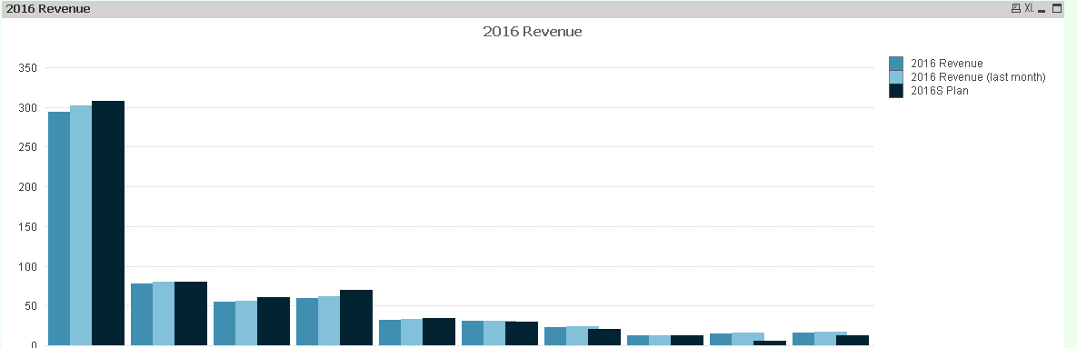
I have a overlapping bar chart showing current version revenue forecast VS last month version VS Plan
I want current version to the left, last month in the middle and Plan at the right.
But I also want current version above last month and then above Plan.
Now the Qlik bar chart seems do not let me set this preference, but just the right bar above the left ones.
Anyone can kindly help me with this?
Thanks!!
- Mark as New
- Bookmark
- Subscribe
- Mute
- Subscribe to RSS Feed
- Permalink
- Report Inappropriate Content
Hi,
You can try, press ctrl+Shift to move the chart and resize them around to get what you need. Also go to properties->general then click on reset user resizing to allow resizing to be easier.
Alternatively, please upload a sample qvw to make it easier for us to help
- Mark as New
- Bookmark
- Subscribe
- Mute
- Subscribe to RSS Feed
- Permalink
- Report Inappropriate Content
u can make changes by using
cntrl+shift select ur chart and move ur positions and
chking below options in general tab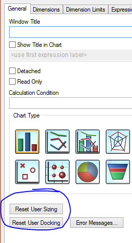
- Mark as New
- Bookmark
- Subscribe
- Mute
- Subscribe to RSS Feed
- Permalink
- Report Inappropriate Content
Hello,
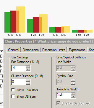
if the order of your expressions is not that important, you can set Bar Distance parameter with minus values (-4) and Cluster Distance with positive (8). It is under Properties->Presentation section.
This allows a little overlapping over expressions but the limitation is that the very last expression always overlaps the previous one.
- Mark as New
- Bookmark
- Subscribe
- Mute
- Subscribe to RSS Feed
- Permalink
- Report Inappropriate Content
Thanks for all the replies and the willingness to help!
Let me upload the example here.
The format I want to show in this overlapping bar chart is:
1. From left to right: Forecast > Forecast (Last Month) > Plan
2. Overlapping: from left to right also, which means Forecast > Forecast (Last Month) > Plan
As Ismail said, the very last expression, which is the right one always overlaps the left ones.
Thanks Ismail for the suggestion. I have also tried that before but I think users will still be distracted but that transparency.
Since we used to read data and charts from left to right, I hope the current Forecast (which is supposed the most important information) stands out by putting it at the left but not overlapping by other charts. I hope there is some trick way I can do that