Unlock a world of possibilities! Login now and discover the exclusive benefits awaiting you.
- Qlik Community
- :
- All Forums
- :
- QlikView App Dev
- :
- Problem with date field
- Subscribe to RSS Feed
- Mark Topic as New
- Mark Topic as Read
- Float this Topic for Current User
- Bookmark
- Subscribe
- Mute
- Printer Friendly Page
- Mark as New
- Bookmark
- Subscribe
- Mute
- Subscribe to RSS Feed
- Permalink
- Report Inappropriate Content
Problem with date field
Dear all,
I am very new to qlikview and I have a problem with regards to a date field which contains information like:
(F11, F12, 2015 P01, ... 2015 P12, 2016 P01, ... , 2016 P12, 2015 Q1, 2015 Q2) and the list goes on,
What would be the best way to visualize this data if I want to create a bar chart with the dates running on the x axis. The Y axis would then represent the cash revenue.
I would also like to have the data in the x axis segmented into quarters and months in the form of (p01-p12), and a total cash revenue summed up over the year 2015.
Attached below is a sketch as to what I would like to be represented in my bar chart. Forgive the really ugly and primitive drawing.
Thanks so much for your input and assistance, thanks in advance.
Kind regards,
Royce Tang
- Tags:
- qlikview_scripting
- Mark as New
- Bookmark
- Subscribe
- Mute
- Subscribe to RSS Feed
- Permalink
- Report Inappropriate Content
It might help us help you better if you can provide some real data and provide the expected output. Would you be able to provide a sample?
- Mark as New
- Bookmark
- Subscribe
- Mute
- Subscribe to RSS Feed
- Permalink
- Report Inappropriate Content
Cheers for the reply Sunny ! I am not sure how to link the files over but I can try to type it out here
sales_type Customer Date Cash
b2b xy 2015P01 200
b2b xy 2015P02 220
b2b xyh 2015P02 300
b2b xyah 2015P02 200
b2c xyh 2015P03 206
b2c xf 2015P04 900
b2c xy 2015P05 206
b2d xyr 2016P01 200
b2a xyd 2016P02 200
b2b xy 2016PPP03 400
b2b xy F1 400
b2b xy F8 1400
my expected output is to have a bar graph with 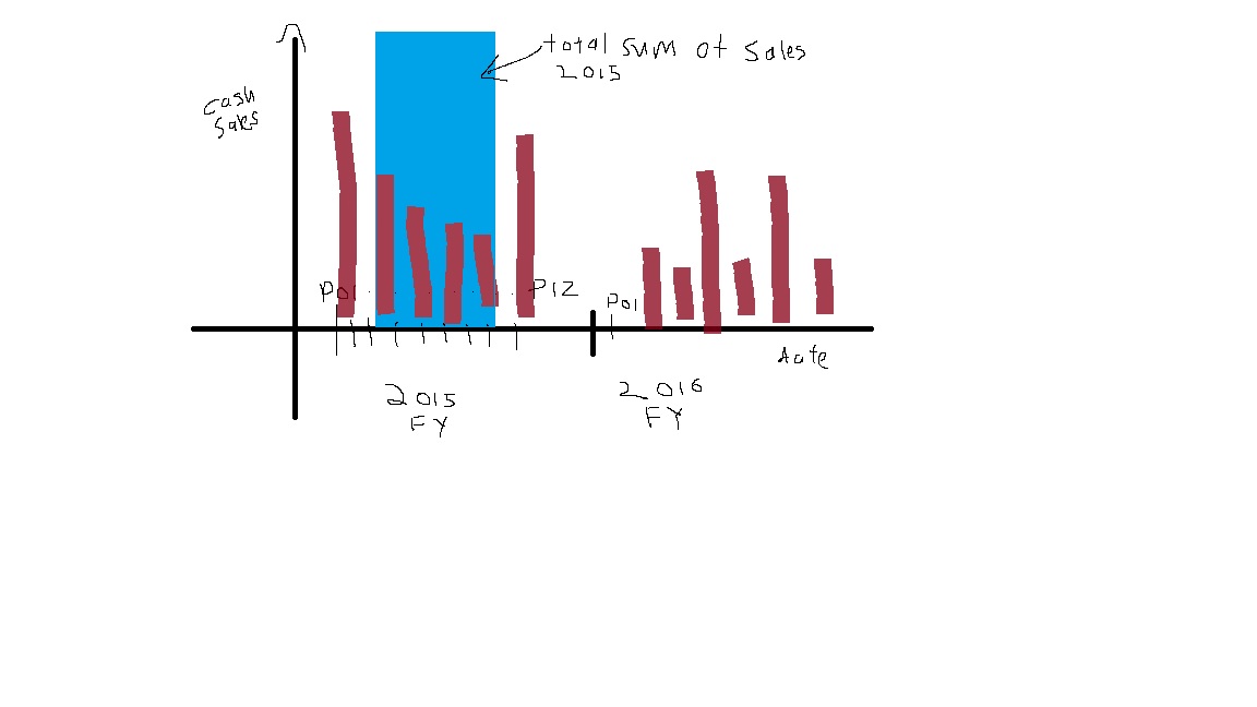
- Mark as New
- Bookmark
- Subscribe
- Mute
- Subscribe to RSS Feed
- Permalink
- Report Inappropriate Content
So in addition to sales for individual sales for each period, you want to highlight the total sales for each year? Is that what you are looking for?
- Mark as New
- Bookmark
- Subscribe
- Mute
- Subscribe to RSS Feed
- Permalink
- Report Inappropriate Content
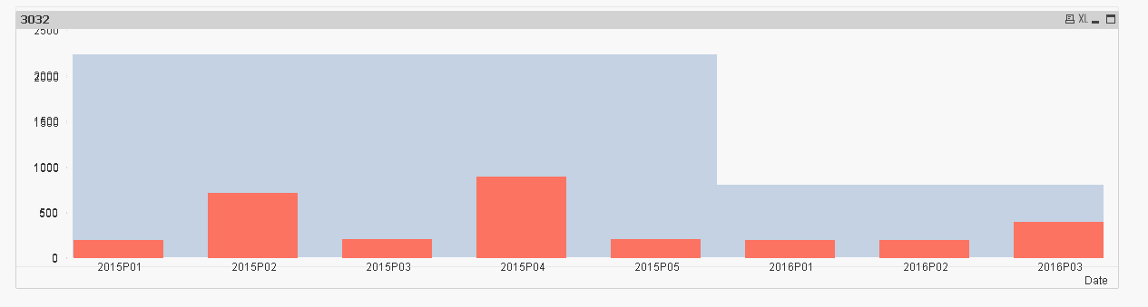
thats exactly what I am looking for ! I have tried to solve this problem and have got to a point as of such as seen in the link
- Mark as New
- Bookmark
- Subscribe
- Mute
- Subscribe to RSS Feed
- Permalink
- Report Inappropriate Content
These are two overlapping charts and that's the best I am able to do.... see if this works for you