Unlock a world of possibilities! Login now and discover the exclusive benefits awaiting you.
- Qlik Community
- :
- All Forums
- :
- QlikView App Dev
- :
- Properties of Circular Gauge representation in Piv...
- Subscribe to RSS Feed
- Mark Topic as New
- Mark Topic as Read
- Float this Topic for Current User
- Bookmark
- Subscribe
- Mute
- Printer Friendly Page
- Mark as New
- Bookmark
- Subscribe
- Mute
- Subscribe to RSS Feed
- Permalink
- Report Inappropriate Content
Properties of Circular Gauge representation in Pivot Chart
Hi,
I have the following data in my data model:
| Resource Name | Project Type | Project Name | Projected Hours | Projected Dollars | Actual Hours | Actual Dollars |
I have ProjectedHours and ActualHours week-wise in my data model. I have taken the sum(ProjectedHours) and sum(ActualHours) directly in my attached sample data.
I have to show the how much is the Actual against Projected in a Guage chart inside Pivot Chart
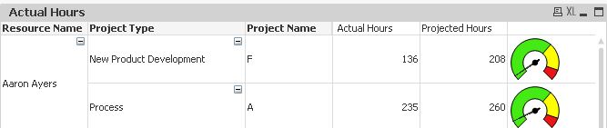
The needle should move according to the Actual Hours.
Green: 0-65% Actual of Projected
Yellow: 65-90% Actual of Projected
Red: >90% Actual of Projected
However, the needles aren't moving correctly. In the above snapshot,
136 Actuals is about 65% of the Projected. So the needle should be in yellow zone
235 Actuals is about 90% of the Projected. So the needle should be in red zone.
I have attached the sample app. Can someone please help?
Thanks,
YASH
Accepted Solutions
- Mark as New
- Bookmark
- Subscribe
- Mute
- Subscribe to RSS Feed
- Permalink
- Report Inappropriate Content
Check this -
Change your expression to -
=num(Sum([Actual Hours])/ sum([Projected Hours]),'##%')
- Mark as New
- Bookmark
- Subscribe
- Mute
- Subscribe to RSS Feed
- Permalink
- Report Inappropriate Content
Check this -
Change your expression to -
=num(Sum([Actual Hours])/ sum([Projected Hours]),'##%')
- Mark as New
- Bookmark
- Subscribe
- Mute
- Subscribe to RSS Feed
- Permalink
- Report Inappropriate Content
Thank you so much Neelam...really appreciate it!