Unlock a world of possibilities! Login now and discover the exclusive benefits awaiting you.
- Qlik Community
- :
- All Forums
- :
- QlikView App Dev
- :
- QlikView - Average of different columns
- Subscribe to RSS Feed
- Mark Topic as New
- Mark Topic as Read
- Float this Topic for Current User
- Bookmark
- Subscribe
- Mute
- Printer Friendly Page
- Mark as New
- Bookmark
- Subscribe
- Mute
- Subscribe to RSS Feed
- Permalink
- Report Inappropriate Content
QlikView - Average of different columns
I am a complete newbie on QlikView, and have managed to figure out bits and pieces, but this is leaving me stumped.
In Excel I find it easy to calculate the average of 3 different columns, but how to create a graph from these averages in Qlikview is eluding me. I have managed to get the graph to show the overall average of the three columns, but I want it to show these averages by supplier along the x axis. I have tried simply adding 'Supplier' as a dimension, but it then says "No data to show". I've tried browsing previous forum threads, but nothing seems to answer my specific question.
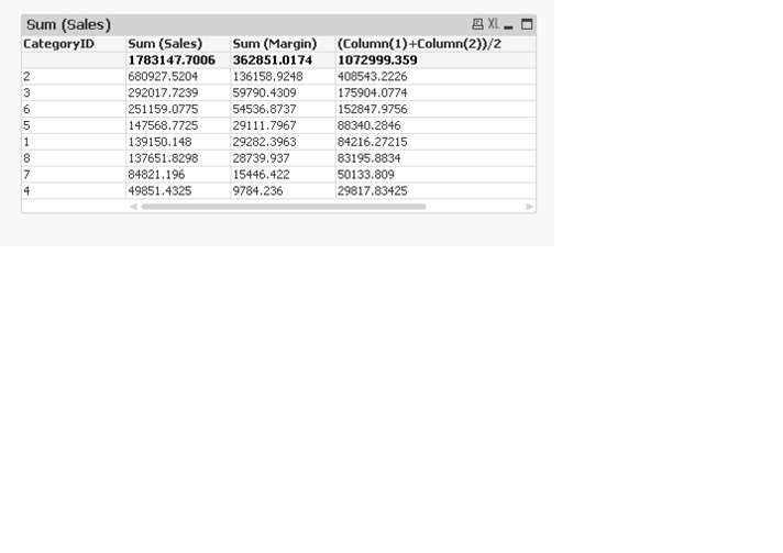
I've attached a screenshot of my dashboard - the bottom left graph is the one I'm trying to create, the top right table shows the data I'm working from.
Any help will be very greatly appreciated!
- Tags:
- new_to_qlikview
Accepted Solutions
- Mark as New
- Bookmark
- Subscribe
- Mute
- Subscribe to RSS Feed
- Permalink
- Report Inappropriate Content
- Mark as New
- Bookmark
- Subscribe
- Mute
- Subscribe to RSS Feed
- Permalink
- Report Inappropriate Content
What is the expression you are using?
- Mark as New
- Bookmark
- Subscribe
- Mute
- Subscribe to RSS Feed
- Permalink
- Report Inappropriate Content
In order to get the average of all 3 I'm just using the below, but it's obviously completely wrong. I've been fine with averages in the past, as they've only been for a single column, therefore, avg(column) has always worked fine
avg(Month1Perf)&(Month2Perf)&(Month3Perf)
- Mark as New
- Bookmark
- Subscribe
- Mute
- Subscribe to RSS Feed
- Permalink
- Report Inappropriate Content
May be try this:
RangeAvg(Month1Perf, Month2Perf, Month3Perf)
- Mark as New
- Bookmark
- Subscribe
- Mute
- Subscribe to RSS Feed
- Permalink
- Report Inappropriate Content
That works! Thanks  I knew it would be something simple I was missing.
- Mark as New
- Bookmark
- Subscribe
- Mute
- Subscribe to RSS Feed
- Permalink
- Report Inappropriate Content
Hi
you can find the average by using
(Column(1)+Column(2)+Column(3))/3