Unlock a world of possibilities! Login now and discover the exclusive benefits awaiting you.
- Qlik Community
- :
- All Forums
- :
- QlikView App Dev
- :
- Re: Qlikview - Not dependency values
- Subscribe to RSS Feed
- Mark Topic as New
- Mark Topic as Read
- Float this Topic for Current User
- Bookmark
- Subscribe
- Mute
- Printer Friendly Page
- Mark as New
- Bookmark
- Subscribe
- Mute
- Subscribe to RSS Feed
- Permalink
- Report Inappropriate Content
Qlikview - Not dependency values
Hello,
I’ve this Data Mart in Qlikview:
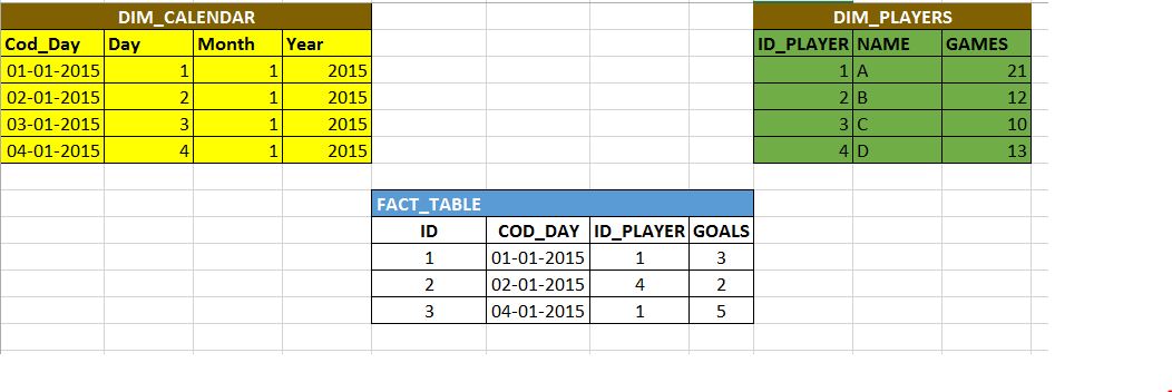
The Dim_Calendar represents the Calendar of the Year
The Dim_Players represents the a team player statistics.
The fact table gives me the total goals of each player in a Team.
I want to have a bar chart to show us the evolution of goals of each player.
This part is easy and could already implement. Except that I'm not getting a point :
If you repair the Player 1 ( ID_PLayer = 1) did not score on 01/03/2015 , but he continues with three goals on league (scored on day 01/01/2015 ) , however the fact table only contains the dates where the player scored goals. So, the chart on Qlikview for the player 1 only returns the following dates:
- 01-01-2015
- 04-01-2015
But I want to create intelligent enough in chart to realize this goals: even though the player has not marked in that date he continues with the same previous goals. So with this data mart the chart should have for the player 1:
- 01-01-2015 - 3
- 02-01-2015 - 3
- 03-01-2015 - 3
- 04-01-2015 - 5
How can I achieve that?
Accepted Solutions
- Mark as New
- Bookmark
- Subscribe
- Mute
- Subscribe to RSS Feed
- Permalink
- Report Inappropriate Content
Try this expression:
=If(Sum(GOALS) > 0, Sum({<ID_PLAYER>}GOALS), Above([GOALS!])).
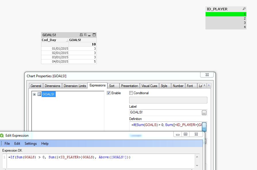
Here GOAL! is the Label for the expression
- Mark as New
- Bookmark
- Subscribe
- Mute
- Subscribe to RSS Feed
- Permalink
- Report Inappropriate Content
Henric describes how to do this in the load script :
- Mark as New
- Bookmark
- Subscribe
- Mute
- Subscribe to RSS Feed
- Permalink
- Report Inappropriate Content
Try this expression:
=If(Sum(GOALS) > 0, Sum({<ID_PLAYER>}GOALS), Above([GOALS!])).
Here GOAL! is the Label for the expression
- Mark as New
- Bookmark
- Subscribe
- Mute
- Subscribe to RSS Feed
- Permalink
- Report Inappropriate Content
Here comes a version that avoids If() and use Trellis to visualize goals over time for each player:

- Mark as New
- Bookmark
- Subscribe
- Mute
- Subscribe to RSS Feed
- Permalink
- Report Inappropriate Content
Perfect Sunny T 
Only one more question:
I'm using external data to define labels for expression. Like that:
=only({<LABELID={'FIELD'}>}LABELTX)
How I insert that label in Above() function?
- Mark as New
- Bookmark
- Subscribe
- Mute
- Subscribe to RSS Feed
- Permalink
- Report Inappropriate Content
Try this expression:
=If(Sum(GOALS) > 0, Sum({<ID_PLAYER>}GOALS), Above(Column(1)))
and use your expression for label and it should work