Unlock a world of possibilities! Login now and discover the exclusive benefits awaiting you.
- Qlik Community
- :
- All Forums
- :
- QlikView App Dev
- :
- Qlikview stacked bar chart for this type of table
- Subscribe to RSS Feed
- Mark Topic as New
- Mark Topic as Read
- Float this Topic for Current User
- Bookmark
- Subscribe
- Mute
- Printer Friendly Page
- Mark as New
- Bookmark
- Subscribe
- Mute
- Subscribe to RSS Feed
- Permalink
- Report Inappropriate Content
Qlikview stacked bar chart for this type of table
Hello, I am trying to make a graph of the type that I indicate,which is based on a type table like the one I attached.
This table contains three fields, date, group and and state (indicator that is a traffic light),
1 would be green, 2 would be yellow and 3 would be red.
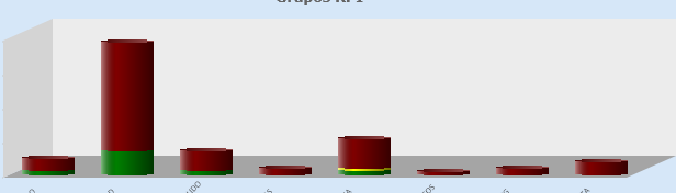
I want to represent by stacked bars the number of elements in each group in a bar of three colors (green, yellow and red) .where each color represents the number of elements of that type.
I would also like to be able to contemplate the dates in the graph, I don't know if it would be possible.
I also attach a type of graphic like the one I am trying to make.
Thank you very much in advance.
Accepted Solutions
- Mark as New
- Bookmark
- Subscribe
- Mute
- Subscribe to RSS Feed
- Permalink
- Report Inappropriate Content
Hi @Fernan
Please find updated QVW.
Abhijit
keep Qliking...
Help users find answers! Don't forget to mark a solution that worked for you!
- Mark as New
- Bookmark
- Subscribe
- Mute
- Subscribe to RSS Feed
- Permalink
- Report Inappropriate Content
Hi @Fernan,
We have that kind of data in Excel file.
if you filter on bank and Semaphore State in excel you will get 135 .

Abhijit
keep Qliking...
Help users find answers! Don't forget to mark a solution that worked for you!
- Mark as New
- Bookmark
- Subscribe
- Mute
- Subscribe to RSS Feed
- Permalink
- Report Inappropriate Content
Oh, sorry, you're right, I don't know why filtering in the table on the left shows only those values.
It seems that if it works correctly .
Thank you very much for your help and interest.
Best regards.
- Mark as New
- Bookmark
- Subscribe
- Mute
- Subscribe to RSS Feed
- Permalink
- Report Inappropriate Content
Hi @Fernan,
PLease find attached QVW file. I have tried to get to the solution as per my understanding.
Abhijit
keep Qliking...
Help users find answers! Don't forget to mark a solution that worked for you!
- Mark as New
- Bookmark
- Subscribe
- Mute
- Subscribe to RSS Feed
- Permalink
- Report Inappropriate Content
Thank you very much for answering, but it does not work correctly, if we filter by BANK, and then by colors, 1-Green, 2-yellow and 3-red, the quantities of elements of that group and color are not shown, for example, for BANK for green there are 6 elements, for yellow BANK there are 2 elements and for Red there are also 6, but they are not represented. In addition, the colors that are analyzed coincide with the bar.
Thanks in advance.
Thank you in advanced.
- Mark as New
- Bookmark
- Subscribe
- Mute
- Subscribe to RSS Feed
- Permalink
- Report Inappropriate Content
Hi @Fernan
Please find updated QVW.
Abhijit
keep Qliking...
Help users find answers! Don't forget to mark a solution that worked for you!
- Mark as New
- Bookmark
- Subscribe
- Mute
- Subscribe to RSS Feed
- Permalink
- Report Inappropriate Content
Thank you very much again for your attention, but the figures still do not square, for example for BANK red there are six elements and it indicates many more. Attached it
Thanks in advanced
- Mark as New
- Bookmark
- Subscribe
- Mute
- Subscribe to RSS Feed
- Permalink
- Report Inappropriate Content
Hi @Fernan,
We have that kind of data in Excel file.
if you filter on bank and Semaphore State in excel you will get 135 .
Abhijit
keep Qliking...
Help users find answers! Don't forget to mark a solution that worked for you!
- Mark as New
- Bookmark
- Subscribe
- Mute
- Subscribe to RSS Feed
- Permalink
- Report Inappropriate Content
Oh, sorry, you're right, I don't know why filtering in the table on the left shows only those values.
It seems that if it works correctly .
Thank you very much for your help and interest.
Best regards.