Unlock a world of possibilities! Login now and discover the exclusive benefits awaiting you.
- Qlik Community
- :
- All Forums
- :
- QlikView App Dev
- :
- Radar Chart Question
- Subscribe to RSS Feed
- Mark Topic as New
- Mark Topic as Read
- Float this Topic for Current User
- Bookmark
- Subscribe
- Mute
- Printer Friendly Page
- Mark as New
- Bookmark
- Subscribe
- Mute
- Subscribe to RSS Feed
- Permalink
- Report Inappropriate Content
Radar Chart Question
Hey guys. I'm trying to make a radar chart for the first time, and I can't seem to figure it out. Could you assist?
I have a few fields. Here are some examples:
[Ability to think on their feet]
[Clarity Content]
[Preparation]
Now, these fields have values in them, which are tied to the particular person who graded them. So we have a presenter, and that presenter gives a score for each of the sampled 3 fields I mentioned above.
These values range from 1-5.
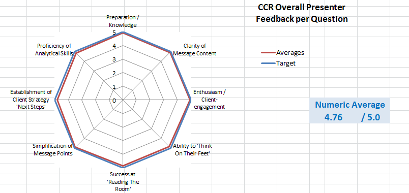
I need to make a radar chart for this data, plotting the values from those fields. I've attached the picture that I'm trying to replicate.
Please help!
- Mark as New
- Bookmark
- Subscribe
- Mute
- Subscribe to RSS Feed
- Permalink
- Report Inappropriate Content
hi,
Radar chart is nothing but a line chart which represents the line in 360 degree.
so first of all try to make a line chart for the required dimensions and expression... if it works fine then put the same logic in Radar chart.
if still you get any issue.. then post the sample data/app.
HTH
sushil
- Mark as New
- Bookmark
- Subscribe
- Mute
- Subscribe to RSS Feed
- Permalink
- Report Inappropriate Content
Hi,
I think your problem is that you have several dimension fields. Try and read the table as a crosstable giving you Questions in one field and Answers in one field. Then you can add Question as your only dimension and use Answer for you expression.
Something like this:
CrossTable(Question, Answer)
LOAD Index,
[Ability to think on their feet],
[Clarity Content],
[Preparation]
FROM
[radar.xlsx]
(ooxml, embedded labels, header is 1 lines, table is Sheet1);
BR,
Ida
- Mark as New
- Bookmark
- Subscribe
- Mute
- Subscribe to RSS Feed
- Permalink
- Report Inappropriate Content
Hi:
A radar or radial chart can be used as a decision making chart.
Imagine you want to compare 2 or more individuals by a few attributes. I’ve attached an example.
With a radar graphic o spider web graphic, data are presented in a way, that it is possible to see each individual at each attribute.
In this QlikView graphic it is not possible to set a different scale for each attribute. You can do that in the script.
Let’s say I’m looking for a flat to live in. What attributes I’d look for: Price, Square Meters, Good Communication with my workplace…
What decision to take: The optimal is that individual with the largest area.