Unlock a world of possibilities! Login now and discover the exclusive benefits awaiting you.
- Qlik Community
- :
- All Forums
- :
- QlikView App Dev
- :
- Radar Chart
- Subscribe to RSS Feed
- Mark Topic as New
- Mark Topic as Read
- Float this Topic for Current User
- Bookmark
- Subscribe
- Mute
- Printer Friendly Page
- Mark as New
- Bookmark
- Subscribe
- Mute
- Subscribe to RSS Feed
- Permalink
- Report Inappropriate Content
Radar Chart
Hi ,
I Have data like this in Excel.
| Cust | Serial no | Questionnaires | Score |
| Axis Bank | 1 | What is your adoption rate at your organization? | 5 |
| Hdfc | 2 | What is your adoption rate at your organization? | 7 |
| ICICI | 3 | How much of your Resources capacity? | 7 |
| Citi Bank | 4 | Is your software in Cloud? | 6 |
how can I create a meaningful Radar chart by using this data.
here Customer data is nothing but client , and questionnaires is for Vendor .
and score is how much each client is rating for vendors out of 10 and out of these available questions.
Report is nothing but a survey monkey example, how to create a meaningful chart by using this data, different KPI's
- Mark as New
- Bookmark
- Subscribe
- Mute
- Subscribe to RSS Feed
- Permalink
- Report Inappropriate Content
First of all understand when to use radar chart.
A radar chart is a graphical method of displaying multivariate data in the form of a two-dimensional chartof three or more quantitative variables represented on axes starting from the same point. The relative position and angle of the axes is typically uninformative
- Mark as New
- Bookmark
- Subscribe
- Mute
- Subscribe to RSS Feed
- Permalink
- Report Inappropriate Content
Hi Sujeet,
I know when to use Radar chart, but requirement is to create this report in Radar chart only.
see if you can help
- Mark as New
- Bookmark
- Subscribe
- Mute
- Subscribe to RSS Feed
- Permalink
- Report Inappropriate Content
Hi all,
Qlik Sense has no and oficial radar chart but you could browse Qlik Branch. There are two options from developers.
See you
- Mark as New
- Bookmark
- Subscribe
- Mute
- Subscribe to RSS Feed
- Permalink
- Report Inappropriate Content
Hi,
The appearance of your chart should be determined by the idea / goal that it visualizes. For example, below is a picture from book Gene Zelazny "Say it with charts", when and what type of chart is recommended to use.
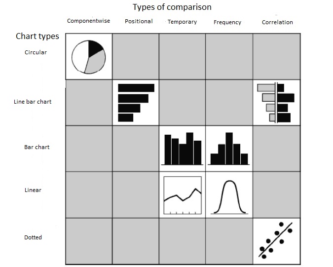
Regards,
Andrey