Unlock a world of possibilities! Login now and discover the exclusive benefits awaiting you.
- Qlik Community
- :
- All Forums
- :
- QlikView App Dev
- :
- RangeSum Chart with Calculated Dimensions?
- Subscribe to RSS Feed
- Mark Topic as New
- Mark Topic as Read
- Float this Topic for Current User
- Bookmark
- Subscribe
- Mute
- Printer Friendly Page
- Mark as New
- Bookmark
- Subscribe
- Mute
- Subscribe to RSS Feed
- Permalink
- Report Inappropriate Content
RangeSum Chart with Calculated Dimensions?
Hi All,
I am trying to find some information of how to display a table with a RangeSum expression and a calculated dimensions in a chart. I've searched the community pages and on twitter with no luck so far.
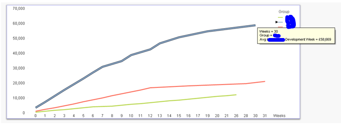
The table shows a range sum expression calculating the running average value per group by the calculated dimension of Week and Group. (variables altered for privacy) The table shows the correctly calculated data however, when I convert this into a chart, the values are not displayed correctly - see screenshots and detail below.
Expression
=RangeSum(Above(TOTAL sum({<
/
RangeSum(Above(TOTAL Count(DISTINCT(C)),0,RowNo(TOTAL)))
Dimensions
Weeks
=if(([Creation Date]-[Date])/7<0,0,
if(isnull([Creation Date]-[Date]),0,Round(([Creation Date]-[Date])/7)))
Group
=if(Match(Group,'1','2','3'),Group)
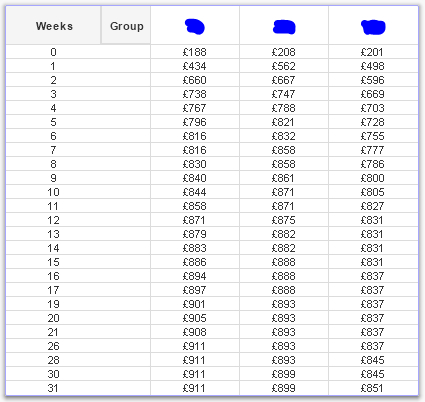
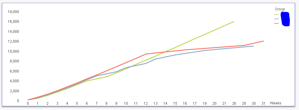
Chart shows correct weeks and groups but the expression values are not in line with the correct values that are shown in the table - see axes from £0 - £18,000 - Summing the values rather than the rangesum.
Any help on this would be greatly appreciated 
Thanks all!
Rachel
- « Previous Replies
-
- 1
- 2
- Next Replies »
- Mark as New
- Bookmark
- Subscribe
- Mute
- Subscribe to RSS Feed
- Permalink
- Report Inappropriate Content
Try this as your expression:
Aggr(
RangeSum(Above(Sum({<
/
RangeSum(Above(Count(DISTINCT(C)),0,RowNo()))
, Group, Weeks)
- Mark as New
- Bookmark
- Subscribe
- Mute
- Subscribe to RSS Feed
- Permalink
- Report Inappropriate Content
Hi,
Thanks for getting back.
'Weeks' is a calculated dimension and not a variable so not recognised in the expression.
Rachel
- Mark as New
- Bookmark
- Subscribe
- Mute
- Subscribe to RSS Feed
- Permalink
- Report Inappropriate Content
May be create it in the script? Something like this
LOAD ([Creation Date]-[Date])/7 as NewField
and then it might work?
- Mark as New
- Bookmark
- Subscribe
- Mute
- Subscribe to RSS Feed
- Permalink
- Report Inappropriate Content
Hi,
I had tried this previously without the Agg() and had no luck.
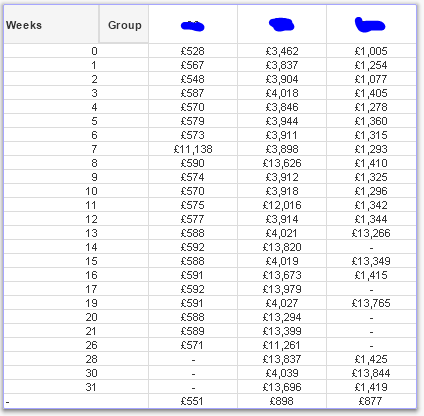
I have updated the script to include 'Weeks' for the dimension and the Agg() in the expression - see below table, values are not showing as rangesum 
R
- Mark as New
- Bookmark
- Subscribe
- Mute
- Subscribe to RSS Feed
- Permalink
- Report Inappropriate Content
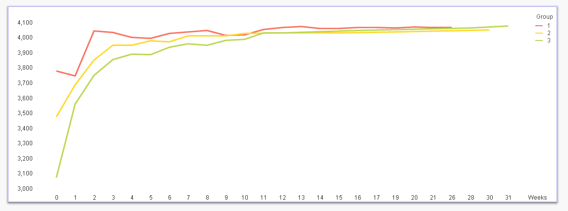
Chart also not showing rangesum value - still summing
- Mark as New
- Bookmark
- Subscribe
- Mute
- Subscribe to RSS Feed
- Permalink
- Report Inappropriate Content
Would you be able to share a sample qvw file to look at the issue?
- Mark as New
- Bookmark
- Subscribe
- Mute
- Subscribe to RSS Feed
- Permalink
- Report Inappropriate Content
I have attached an example qvd.
- Mark as New
- Bookmark
- Subscribe
- Mute
- Subscribe to RSS Feed
- Permalink
- Report Inappropriate Content
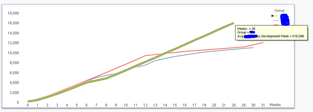
Is this sort of kind of what you are looking for?
Few things to note:
1) Select 'No Accumulation' instead of 'Full Accumulation'
2) Use set analysis instead of calculated dimension for Group
3) I don't know if you have QV12 or not, but it seems that Week are not sorted from 0 to n in ascending order, but if you have QV12 installed you can do it on the front end of the application using The sortable Aggr function is finally here!
Expression:
Aggr(
RangeSum(Above(Sum({<Group = {1,2,3}>}Value),0,RowNo()))
/
RangeSum(Above(Count({<Group = {1,2,3}>} DISTINCT Concat),0,RowNo()))
, Group, (Weeks,(NUMERIC)))
- Mark as New
- Bookmark
- Subscribe
- Mute
- Subscribe to RSS Feed
- Permalink
- Report Inappropriate Content
Hi Sunny,
Its definitely closer than I was! See attached example - the 'No Accumulation' shows the correct direction of development with the curve, however,
- the set analysis for group does not work in the expression - one line shown and no individual groups shown
In the attached I have updated the expression to 'no accumulation' but the values in the chart still don't match the table.
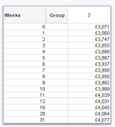
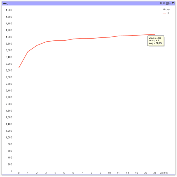
Group 3 at 28 weeks in the table is £4,064 however the chart shows £4,056.
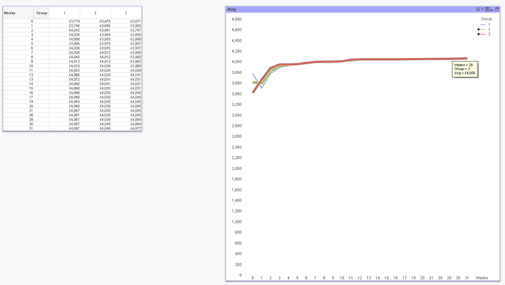
I think the dimension is causing the problem as when I click the groups in isolation the correct values are displayed in the chart!
Let me know if you have any ideas on this.
Thanks again
Rachel
- « Previous Replies
-
- 1
- 2
- Next Replies »