Unlock a world of possibilities! Login now and discover the exclusive benefits awaiting you.
- Qlik Community
- :
- All Forums
- :
- QlikView App Dev
- :
- Re: Reverse a Horizontal Bar Chart.
- Subscribe to RSS Feed
- Mark Topic as New
- Mark Topic as Read
- Float this Topic for Current User
- Bookmark
- Subscribe
- Mute
- Printer Friendly Page
- Mark as New
- Bookmark
- Subscribe
- Mute
- Subscribe to RSS Feed
- Permalink
- Report Inappropriate Content
Reverse a Horizontal Bar Chart.
Hi,
I am new to Qlikview so please go easy.
As I have had no luck with the Parallel Coordinate chart, I thought I would use two bar charts to show the number of calls assigned in and out of a team instead.
To do this I need to reverse a horizontal bar chart for one half of my data.
I need the Dimension Axes on the right and the Bars to run from right to left.
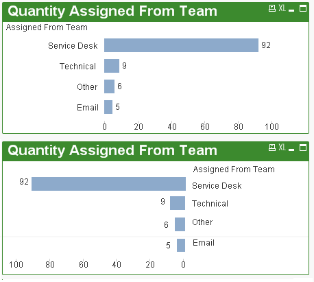
I have attached an image to show what I mean, I created this in Ms Paint so you can see what I am after.
The first chart is normal and the second chart is what I want to achieve.
Is there any way to do this as I have been looking for a couple of hours now with no joy
Many thanks.
- « Previous Replies
- Next Replies »
- Mark as New
- Bookmark
- Subscribe
- Mute
- Subscribe to RSS Feed
- Permalink
- Report Inappropriate Content
Dear Peter,
Right solution for reverse bar chart.
Find attached file for detailed understanding as well as you can check the detail using following URL.
Kind regards,
Ishfaque Ahmed
- Mark as New
- Bookmark
- Subscribe
- Mute
- Subscribe to RSS Feed
- Permalink
- Report Inappropriate Content
Hi James,
Can you please explain how to do this kind of stacked chart (Age Band), where male and female figures are shown on left and right, like butterfly form? I have used your guidelines, but somehow I cannot come up with stacked form, male and female figures are shown separately in different lines, even though I select "stacked".
- I have used 2 dimensions : (1) age group (2) gender
- The expressions are (1) sum(cost) (2) Dual(cost,1) (3) Dual(sum(cost),sum(cost)-2*sum(cost))
- I have used bar chart, horizontal and stacked (you mention combo, but it gives totally different view. Maybe I am missing this part ?)
Thanks a lot,
Zeynep
- Mark as New
- Bookmark
- Subscribe
- Mute
- Subscribe to RSS Feed
- Permalink
- Report Inappropriate Content
Hi,
The chart looks interesting. Can you please share sample dashboard ?
- Mark as New
- Bookmark
- Subscribe
- Mute
- Subscribe to RSS Feed
- Permalink
- Report Inappropriate Content
Hi, do you have an example .qvw for that chart? It's exactly what we need.
Thx in advance.
MK
- Mark as New
- Bookmark
- Subscribe
- Mute
- Subscribe to RSS Feed
- Permalink
- Report Inappropriate Content
i want to try this, can you share a code with me?
- « Previous Replies
- Next Replies »