Unlock a world of possibilities! Login now and discover the exclusive benefits awaiting you.
- Qlik Community
- :
- All Forums
- :
- QlikView App Dev
- :
- Re: Reverse a Horizontal Bar Chart.
- Subscribe to RSS Feed
- Mark Topic as New
- Mark Topic as Read
- Float this Topic for Current User
- Bookmark
- Subscribe
- Mute
- Printer Friendly Page
- Mark as New
- Bookmark
- Subscribe
- Mute
- Subscribe to RSS Feed
- Permalink
- Report Inappropriate Content
Reverse a Horizontal Bar Chart.
Hi,
I am new to Qlikview so please go easy.
As I have had no luck with the Parallel Coordinate chart, I thought I would use two bar charts to show the number of calls assigned in and out of a team instead.
To do this I need to reverse a horizontal bar chart for one half of my data.
I need the Dimension Axes on the right and the Bars to run from right to left.
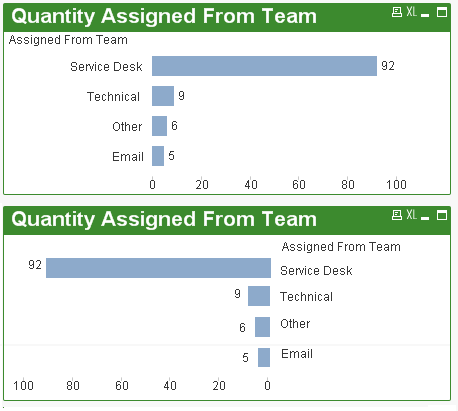
I have attached an image to show what I mean, I created this in Ms Paint so you can see what I am after.
The first chart is normal and the second chart is what I want to achieve.
Is there any way to do this as I have been looking for a couple of hours now with no joy
Many thanks.
- Mark as New
- Bookmark
- Subscribe
- Mute
- Subscribe to RSS Feed
- Permalink
- Report Inappropriate Content
I managed to get that far, but they show on different rows, not the same row. Any idea why?.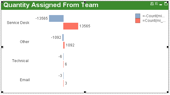
- Mark as New
- Bookmark
- Subscribe
- Mute
- Subscribe to RSS Feed
- Permalink
- Report Inappropriate Content
use 'Stacked ' in the Style > subType
- Mark as New
- Bookmark
- Subscribe
- Mute
- Subscribe to RSS Feed
- Permalink
- Report Inappropriate Content
Hi,
I think I have kind of bodged something together:
It is one chart and it doesn't need a container or floating overlays / text boxes. It does use the "Vertical Labels" trick I picked up from the Community - blog . qvapps . com/2010/09/10/qlikview-tutorial-vertical-labels-inside-bars/
Chart is a standard Combo chart
Dimension in my case is ReferralReasonDesc
Expression 1 is -Count(ReferralID) shown as bar, enabled. Values on Data Points UNticked
Expression 2 is Dual(ReferralReasonDesc, 1) as symbol, enabled and invisible. Values on Data Points ticked
Expression 3 is Dual((count(ReferralId)), count(ReferralId)-(2*(count(ReferralId)))) as symbol, enabled and invisible. Values on Data Points ticked
Chart is sorted by Y-value, Ascending
Expression 2 puts the text at the 0 value
Expression 3 puts the numbers at the end of the bars
Hope this helps!
- Mark as New
- Bookmark
- Subscribe
- Mute
- Subscribe to RSS Feed
- Permalink
- Report Inappropriate Content
Hi Peter,
Sorry, had to check my original thought around alligning values and you can do it using a dual() function.
Dual( Bar Value , Chart Possition)
http://community.qlik.com/message/455896#455896
Richard
- Mark as New
- Bookmark
- Subscribe
- Mute
- Subscribe to RSS Feed
- Permalink
- Report Inappropriate Content
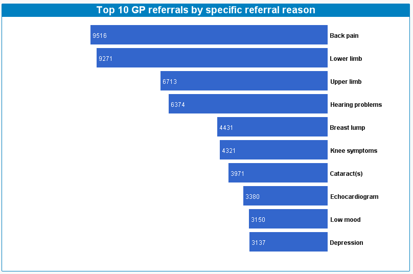
Richard Pearce That's exactly the trick I used in the chart below, twice in fact! 
- Mark as New
- Bookmark
- Subscribe
- Mute
- Subscribe to RSS Feed
- Permalink
- Report Inappropriate Content
do you mind posting the trick here to achieve that ? might be helpful for all.
- Mark as New
- Bookmark
- Subscribe
- Mute
- Subscribe to RSS Feed
- Permalink
- Report Inappropriate Content
Have just edited the post, My QV
- Mark as New
- Bookmark
- Subscribe
- Mute
- Subscribe to RSS Feed
- Permalink
- Report Inappropriate Content
🙂 It's a cool trick, I only just found it because I wanted to confirm my orignal comment (which it turns out I was too hasty to say it can't be done - I should have known better 🙂 )
Cheers James !!
- Mark as New
- Bookmark
- Subscribe
- Mute
- Subscribe to RSS Feed
- Permalink
- Report Inappropriate Content
very well done .. thanks James
- Mark as New
- Bookmark
- Subscribe
- Mute
- Subscribe to RSS Feed
- Permalink
- Report Inappropriate Content
That works great and gives me a few new toys to play with also.
Many thanks James and everyone else for their help.