Unlock a world of possibilities! Login now and discover the exclusive benefits awaiting you.
- Qlik Community
- :
- All Forums
- :
- QlikView App Dev
- :
- SWitching axis
- Subscribe to RSS Feed
- Mark Topic as New
- Mark Topic as Read
- Float this Topic for Current User
- Bookmark
- Subscribe
- Mute
- Printer Friendly Page
- Mark as New
- Bookmark
- Subscribe
- Mute
- Subscribe to RSS Feed
- Permalink
- Report Inappropriate Content
SWitching axis
Hi
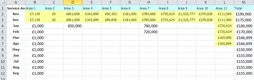
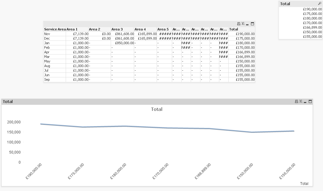
Please see attached app and screenshots.
We want to display cost by month but importantly as a line graph. Works as is as a bar chart.
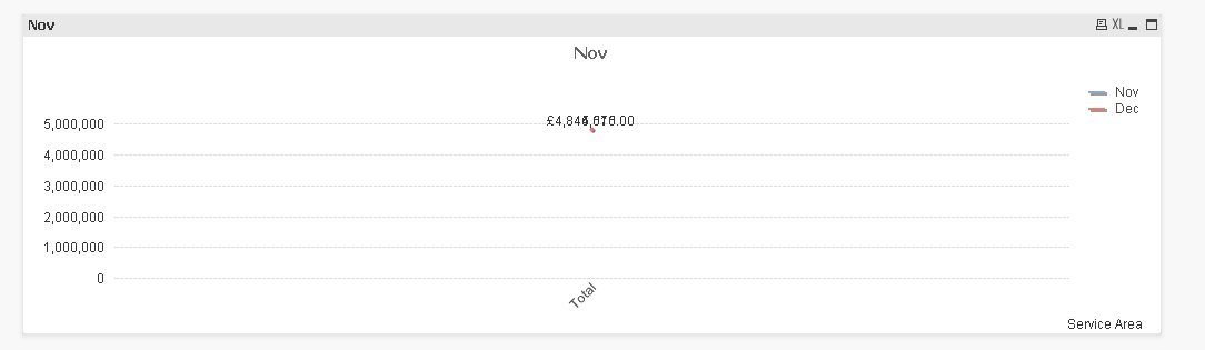
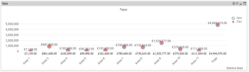
When a line graph is selected it is only showing one series of data - in this case Dec.
Can someone please advise and explain how to get this to work?
Much appreciated.
Chris
- Tags:
- new_to_qlikview
- Mark as New
- Bookmark
- Subscribe
- Mute
- Subscribe to RSS Feed
- Permalink
- Report Inappropriate Content
I believe there are actually two months shown, but with almost identical values...
- Mark as New
- Bookmark
- Subscribe
- Mute
- Subscribe to RSS Feed
- Permalink
- Report Inappropriate Content
If you plot the chart using symbols., you'll see that you have the same data for each month, so it shows as a single overlapped point in the line chart.
- Mark as New
- Bookmark
- Subscribe
- Mute
- Subscribe to RSS Feed
- Permalink
- Report Inappropriate Content
Hi,
Yes values are very similar but we want the months to show along the bottom as the x axis and be spaced out like it looks on a bar chart. The answer would be to be able to switch the series and axis around. So at the moment the series is 'month' and x axis 'total'.
Can this not be switched so series is 'total' and x axis 'month'?
Chris
- Mark as New
- Bookmark
- Subscribe
- Mute
- Subscribe to RSS Feed
- Permalink
- Report Inappropriate Content
Hi,
This is how it works in excel - simple line chart based on selected data - how can this be replicated in Qlikview?
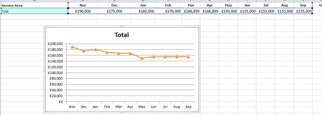
Chris
- Mark as New
- Bookmark
- Subscribe
- Mute
- Subscribe to RSS Feed
- Permalink
- Report Inappropriate Content
Just use only one dimension, your Month field.
- Mark as New
- Bookmark
- Subscribe
- Mute
- Subscribe to RSS Feed
- Permalink
- Report Inappropriate Content
sweuhl
To clarify do this on the chart properties - dimensions tab?
But there is 12 months?
I have transposed the data in excel and loaded that and now the line chart works