Unlock a world of possibilities! Login now and discover the exclusive benefits awaiting you.
- Qlik Community
- :
- All Forums
- :
- QlikView App Dev
- :
- Sales Chart
- Subscribe to RSS Feed
- Mark Topic as New
- Mark Topic as Read
- Float this Topic for Current User
- Bookmark
- Subscribe
- Mute
- Printer Friendly Page
- Mark as New
- Bookmark
- Subscribe
- Mute
- Subscribe to RSS Feed
- Permalink
- Report Inappropriate Content
Sales Chart
Hi All,
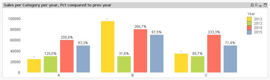
I have yearly sales data category wise. I want to make a chart and show that yearly sales data category wise. Also in the same chart I want to show change %change in sales each year in each category. How can this be achived. Consider the sample data as below.
Year Sales Category
2015 50000 A
2014 60000 A
2013 30000 A
2012 25000 A
2015 70000 B
2014 80000 B
2013 30000 B
2012 95000 B
2015 50000 C
2014 70000 C
2013 30000 C
2012 35000 C
- Tags:
- new_to_qlikview
- Mark as New
- Bookmark
- Subscribe
- Mute
- Subscribe to RSS Feed
- Permalink
- Report Inappropriate Content
See attached example
talk is cheap, supply exceeds demand
- Mark as New
- Bookmark
- Subscribe
- Mute
- Subscribe to RSS Feed
- Permalink
- Report Inappropriate Content
Hi,
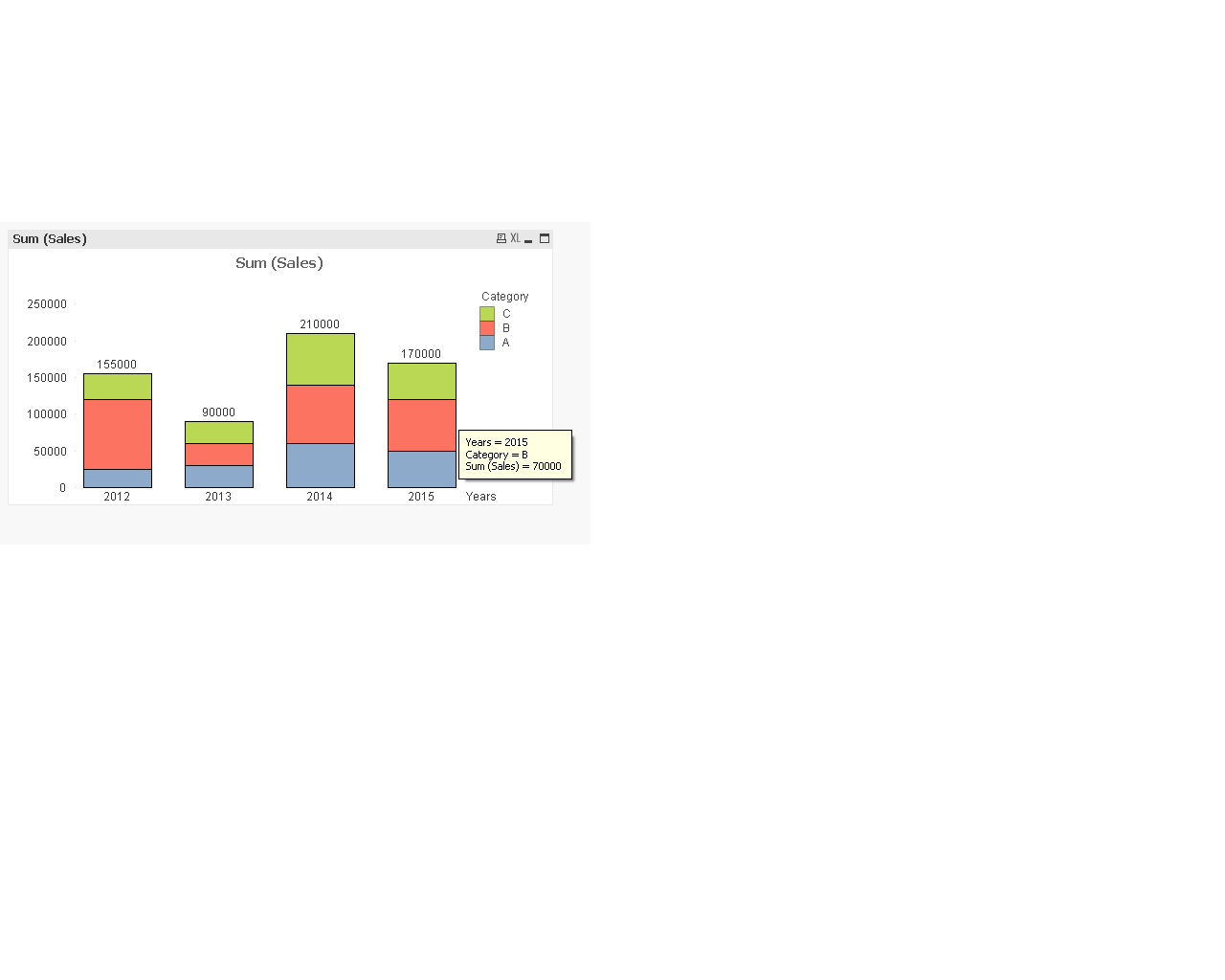
In dimension put year and category fields. Then in style tab click on stacked button.I did that like this.
- Mark as New
- Bookmark
- Subscribe
- Mute
- Subscribe to RSS Feed
- Permalink
- Report Inappropriate Content

Hi,
see the above image, correct values are shown in 4th and 5th column. When using dual function, values are incorrect. How?
And when we remove just dual or add text outside dual then data is also correct. How is this happening??
- Mark as New
- Bookmark
- Subscribe
- Mute
- Subscribe to RSS Feed
- Permalink
- Report Inappropriate Content
Hi,
If you want it on backend, here is the attached solution
- Mark as New
- Bookmark
- Subscribe
- Mute
- Subscribe to RSS Feed
- Permalink
- Report Inappropriate Content
Hi @sushil_Kumar
I Tried in this way for given data from please check this qvw file .
Please give reply after seeing the file 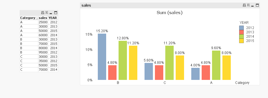
- Mark as New
- Bookmark
- Subscribe
- Mute
- Subscribe to RSS Feed
- Permalink
- Report Inappropriate Content
Or something like this..
see attch
Grtz. Fred
- Mark as New
- Bookmark
- Subscribe
- Mute
- Subscribe to RSS Feed
- Permalink
- Report Inappropriate Content

Sorry, this one is a little better..
Grtz. Fred