Unlock a world of possibilities! Login now and discover the exclusive benefits awaiting you.
- Qlik Community
- :
- All Forums
- :
- QlikView App Dev
- :
- Re: Scatter/Bubble chart data points are off chart...
- Subscribe to RSS Feed
- Mark Topic as New
- Mark Topic as Read
- Float this Topic for Current User
- Bookmark
- Subscribe
- Mute
- Printer Friendly Page
- Mark as New
- Bookmark
- Subscribe
- Mute
- Subscribe to RSS Feed
- Permalink
- Report Inappropriate Content
Scatter/Bubble chart data points are off chart area
Hi,
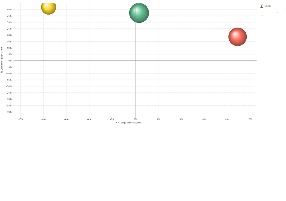
How can I prevent the data points on the graph shown from being plotted partially on and partially off the chart area? (as per the yellow bubble?)
(I don't think I can set a static max for my axis as the data varies a lot, so it wouldn't display well - but I am relatively new to Qlikview - so happy to be wrong.)
Accepted Solutions
- Mark as New
- Bookmark
- Subscribe
- Mute
- Subscribe to RSS Feed
- Permalink
- Report Inappropriate Content
You can calculate the static x/y axis values using an expression that gets the current max value and then adds a bit of headroom. Use Aggr() in your static max expression. Assume your chart x expression is "Sum(Sales)" and the Dimension is Company.
max(Aggr(Sum(Sales),Company)) * 1.2
-Rob
http://masterssummit.com
http://qlikviewcookbook.com
http://www.easyqlik.com
- Mark as New
- Bookmark
- Subscribe
- Mute
- Subscribe to RSS Feed
- Permalink
- Report Inappropriate Content
Thanks! I will do that.
