Unlock a world of possibilities! Login now and discover the exclusive benefits awaiting you.
- Qlik Community
- :
- All Forums
- :
- QlikView App Dev
- :
- Scatter Chart
- Subscribe to RSS Feed
- Mark Topic as New
- Mark Topic as Read
- Float this Topic for Current User
- Bookmark
- Subscribe
- Mute
- Printer Friendly Page
- Mark as New
- Bookmark
- Subscribe
- Mute
- Subscribe to RSS Feed
- Permalink
- Report Inappropriate Content
Scatter Chart
Hi,
I would appreciate some help with trying to create a scatter chart. I would ideally like to short the following:
x-axis = SendingDate
y-axis = SendingTime
Scatter points = OrderStatus
Is the above possible? Basically I am trying to plot the Date and Time of different types of orders (Cancelled, Filled, New, Rejected etc)
Thanks,
Daniel
- Mark as New
- Bookmark
- Subscribe
- Mute
- Subscribe to RSS Feed
- Permalink
- Report Inappropriate Content
Hi Daniel,
For Scatter chart you would need 2 dimensions and 1 expression.
In your case it seems you have 3 dimensions, which might not be ideal for scatter chart.
Saurabh
- Mark as New
- Bookmark
- Subscribe
- Mute
- Subscribe to RSS Feed
- Permalink
- Report Inappropriate Content
Try it with bubble chart instead, for scatter plot you need two measures i.e two expressions.
- Mark as New
- Bookmark
- Subscribe
- Mute
- Subscribe to RSS Feed
- Permalink
- Report Inappropriate Content
Hi Kushal,
Please can you help by providing an example as to how this would work as a bubble chart? I have attached some sample data.
Thanks for your help.
Regards,
Daniel
- Mark as New
- Bookmark
- Subscribe
- Mute
- Subscribe to RSS Feed
- Permalink
- Report Inappropriate Content
hi Daniel,
Select a grid chart> Dimension as SendingDate , Sendingtimestamp and orderstatus.
Exp > sum(orderQty)
This will give you the below graph, Note you have many distinct timestamps so visualy it may not be appealing so while loading I took only 'hr' from your timestamp ( left(SendingTimeStamp,2) as Sendingtime, ) to create the chart.
Hope this helps.

Saurabh Singh
- Mark as New
- Bookmark
- Subscribe
- Mute
- Subscribe to RSS Feed
- Permalink
- Report Inappropriate Content
Thanks Saurabh.
Is there no way I can plot this as a scatter graph? I am basically trying to plot the time and days when OrderStatus is Cancelled, New, Filled etc?
Regards,
Daniel
- Mark as New
- Bookmark
- Subscribe
- Mute
- Subscribe to RSS Feed
- Permalink
- Report Inappropriate Content
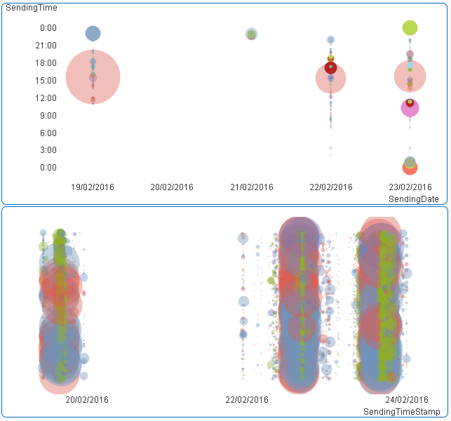
Here are a couple ways to show your data in scatter charts. In both, I'm using color to indicate order status as a way of giving you that as a fourth dimension (date, time, status, quantity). The first is what I think you're asking for. The second is an alternate way to visualize it, with timestamp along the bottom instead of date, and then just a dummy random value vertically to separate out the bubbles. It's less good for seeing some information, and better I think for seeing others. The colors are slightly transparent to better show overlapping values. The second does a better job, I think, of showing data when it overlaps. You'd need a legend for your colors. In this simple example I provided it with a small chart of totals by status.