Unlock a world of possibilities! Login now and discover the exclusive benefits awaiting you.
- Qlik Community
- :
- All Forums
- :
- QlikView App Dev
- :
- Re: Scattered Animated Chart
- Subscribe to RSS Feed
- Mark Topic as New
- Mark Topic as Read
- Float this Topic for Current User
- Bookmark
- Subscribe
- Mute
- Printer Friendly Page
- Mark as New
- Bookmark
- Subscribe
- Mute
- Subscribe to RSS Feed
- Permalink
- Report Inappropriate Content
Scattered Animated Chart
Hi Experts,
I was jsut trying to replicate the Health and Wealth of Nations chart (attached) for my data.
Seems i failed miserably. The circle size is too big. i just want to show the sum of sales (the higher the sales, the bigger the circle).
Can anubody help here to accomplish this.Attaching my file as well
Thanks
- Tags:
- new_to_qlikview
Accepted Solutions
- Mark as New
- Bookmark
- Subscribe
- Mute
- Subscribe to RSS Feed
- Permalink
- Report Inappropriate Content
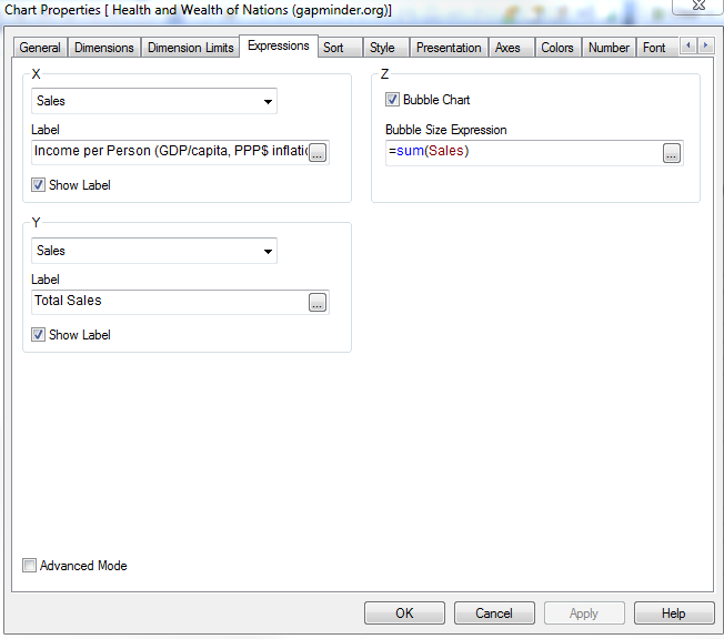
If you don't view the chart in Advanced Mode, it's a bit easier to see what you're doing (fixed .qvw is also attached):
- Mark as New
- Bookmark
- Subscribe
- Mute
- Subscribe to RSS Feed
- Permalink
- Report Inappropriate Content
If you don't view the chart in Advanced Mode, it's a bit easier to see what you're doing (fixed .qvw is also attached):
- Mark as New
- Bookmark
- Subscribe
- Mute
- Subscribe to RSS Feed
- Permalink
- Report Inappropriate Content
Thanks Nicole. That really helped.
Now, i just have couple of queries:
1- Which would be the best setting for the axis here? since now its starting with -20....
2- In second tab, there is a similar chart. I just noticed that it has used custom Grids. Any help as how we can replicate the grid type in my chart (first tab)
- Mark as New
- Bookmark
- Subscribe
- Mute
- Subscribe to RSS Feed
- Permalink
- Report Inappropriate Content
Since what you're displaying on your Y axis is a count which can't be less than zero, you can just set the min of the axis to be 0:
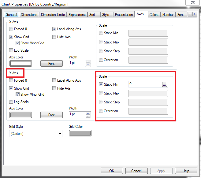
You can do the same thing for the X axis if that is what you want.
As for making the chart on the first tab look the same as the second tab, you can do so using the Format Painter Tool.
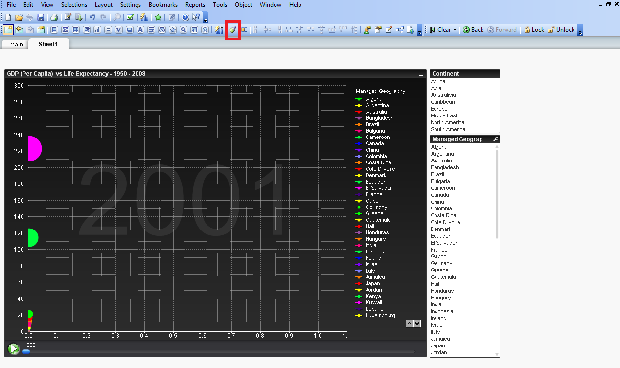
First click on the chart on the second tab, then click the format painter button, then click on the chart on the first tab. It will make them look the same.
- Mark as New
- Bookmark
- Subscribe
- Mute
- Subscribe to RSS Feed
- Permalink
- Report Inappropriate Content
Thanks a ton for such a detailed explanation : )