Unlock a world of possibilities! Login now and discover the exclusive benefits awaiting you.
- Qlik Community
- :
- All Forums
- :
- QlikView App Dev
- :
- Show only selected values in line graph and add up...
- Subscribe to RSS Feed
- Mark Topic as New
- Mark Topic as Read
- Float this Topic for Current User
- Bookmark
- Subscribe
- Mute
- Printer Friendly Page
- Mark as New
- Bookmark
- Subscribe
- Mute
- Subscribe to RSS Feed
- Permalink
- Report Inappropriate Content
Show only selected values in line graph and add up a sum
Hi!
I have data in the following format:
Date, Amount
06.03.1995, 10814,23
21.12.1995, 3760,76
30.01.1998, 3878,63
27.09.1999, 458,76
...
I created a listbox where you can select a date or date range. The sum(Amount) is shown in a line graph. So far so good the result looks like this if 30.01.1998 and 27.09.1999 are selected:
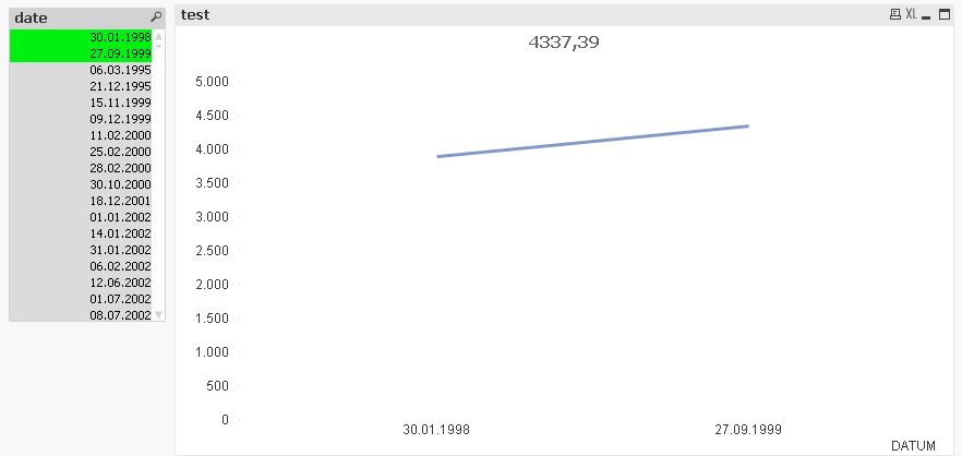
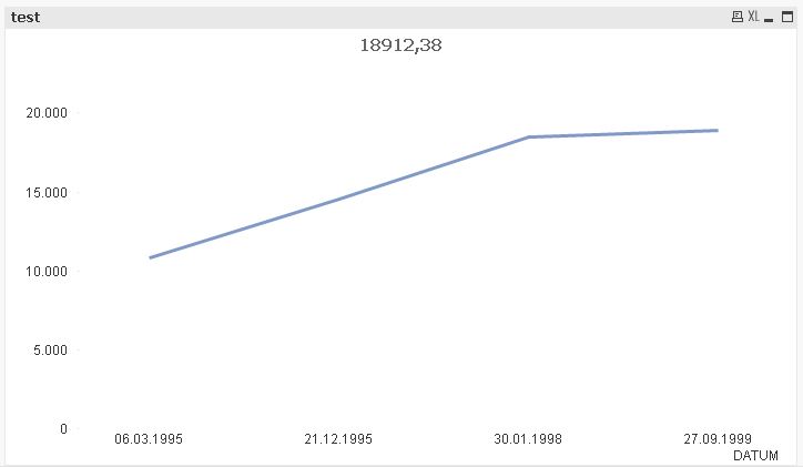
But what I want to do is that the sum of "Amount" where "Date" is smaller than the smallest selected date is add up to the points in the line graph. In the end I want to have the following line graph but without the first two data Points (06.03.1995 and 21.12.1995) in it when the dates in the upper listbox are selected.
I hope you understand my question.
Best regards,
Chris
- Mark as New
- Bookmark
- Subscribe
- Mute
- Subscribe to RSS Feed
- Permalink
- Report Inappropriate Content
Would you be able to share a sample?
- Mark as New
- Bookmark
- Subscribe
- Mute
- Subscribe to RSS Feed
- Permalink
- Report Inappropriate Content
like this:
=sum({<YourDateField={'<=$(=max(YourDateField)'}>} Amount)
- Mark as New
- Bookmark
- Subscribe
- Mute
- Subscribe to RSS Feed
- Permalink
- Report Inappropriate Content
to achieve this you need to make use of the two CALENDAR object in Qlikview which will allow you to select the date range and using the variables you need to capture the calendar selection and then you need to use the same in set analysis
- Mark as New
- Bookmark
- Subscribe
- Mute
- Subscribe to RSS Feed
- Permalink
- Report Inappropriate Content
remove '=' in your case like
=sum({<YourDateField={'<$(=max(YourDateField)'}>} Amount)
- Mark as New
- Bookmark
- Subscribe
- Mute
- Subscribe to RSS Feed
- Permalink
- Report Inappropriate Content
May be this?
=Sum({<Date = {"$(='>' & Date(Min(Date)) & '<' & Date(Max(Date)))"}>}Amount)

- Mark as New
- Bookmark
- Subscribe
- Mute
- Subscribe to RSS Feed
- Permalink
- Report Inappropriate Content
I see I didn't express myself clearly enough. I edited the picture so you can see what I want to achive.
If 30.01.1998 and 27.09.1999 are selected this should be the result:
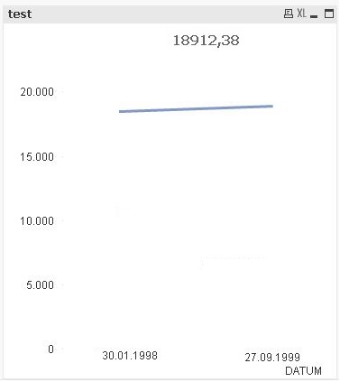
The sum of the amounts of the days before the minimum date selected should be the "invisible" starting point in the line graph.
I added some sample data if that helps. Thanks for your help!