Unlock a world of possibilities! Login now and discover the exclusive benefits awaiting you.
- Qlik Community
- :
- All Forums
- :
- QlikView App Dev
- :
- Show the id's status in terms of active,inactive a...
- Subscribe to RSS Feed
- Mark Topic as New
- Mark Topic as Read
- Float this Topic for Current User
- Bookmark
- Subscribe
- Mute
- Printer Friendly Page
- Mark as New
- Bookmark
- Subscribe
- Mute
- Subscribe to RSS Feed
- Permalink
- Report Inappropriate Content
Show the id's status in terms of active,inactive and both.
I have a data which contains two fields namely id and its performance date. Something like this:
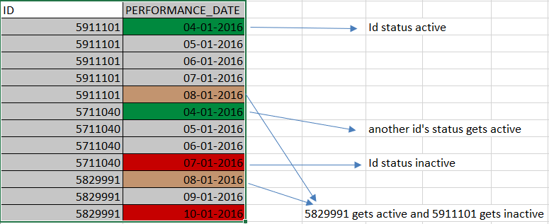
I need to create a chart which shows me the status of the total count of id's getting activated, inactivated and both in a day wise manner.
Sample Output:
Here 2 id's are getting activated on 04-01-16, 1 id is getting inactive on day 7 and lastly '1 id is active - 1 id is inactive' on day 8.
I should show the differentiate the active/inactive/both id's in terms of the color's in the output.

Please provide a solution
- « Previous Replies
-
- 1
- 2
- Next Replies »
Accepted Solutions
- Mark as New
- Bookmark
- Subscribe
- Mute
- Subscribe to RSS Feed
- Permalink
- Report Inappropriate Content
Hi,
I guess one solution using your sample data might look like:

Can you provide the current result of your own efforts to identify the missing pieces?
Just paste it here once you're done.
thanks
regards
Marco
- Mark as New
- Bookmark
- Subscribe
- Mute
- Subscribe to RSS Feed
- Permalink
- Report Inappropriate Content
Can you share your data in excel format?
- Mark as New
- Bookmark
- Subscribe
- Mute
- Subscribe to RSS Feed
- Permalink
- Report Inappropriate Content
Hey. I have attached the dataset. Sheet1 contains my Id and performance date. Kindly provide the solution.
- Mark as New
- Bookmark
- Subscribe
- Mute
- Subscribe to RSS Feed
- Permalink
- Report Inappropriate Content
On what logic you want to calculate the count of active and inactive ids?on basis of colour?
- Mark as New
- Bookmark
- Subscribe
- Mute
- Subscribe to RSS Feed
- Permalink
- Report Inappropriate Content
Yes. Green for active id's, red for inactive id's. if there is a combination of both active and inactive id's for the specific day then it should be separated by '-' (i.e active - inactive count, example: 2-1) and the color should be brown.
- Mark as New
- Bookmark
- Subscribe
- Mute
- Subscribe to RSS Feed
- Permalink
- Report Inappropriate Content
in your sheet1, how do you know that ID is active?
- Mark as New
- Bookmark
- Subscribe
- Mute
- Subscribe to RSS Feed
- Permalink
- Report Inappropriate Content
min date and max date for the particular id. min date for the id refers to id active state and max date refers the inactive state.
- Mark as New
- Bookmark
- Subscribe
- Mute
- Subscribe to RSS Feed
- Permalink
- Report Inappropriate Content
Just paste the code here once you're done.
- Mark as New
- Bookmark
- Subscribe
- Mute
- Subscribe to RSS Feed
- Permalink
- Report Inappropriate Content
Hi,
I guess one solution using your sample data might look like:
Can you provide the current result of your own efforts to identify the missing pieces?
Just paste it here once you're done.
thanks
regards
Marco
- Mark as New
- Bookmark
- Subscribe
- Mute
- Subscribe to RSS Feed
- Permalink
- Report Inappropriate Content
Yes i require the exact result. please provide the code for this output to be executed in qlikview
- « Previous Replies
-
- 1
- 2
- Next Replies »