Unlock a world of possibilities! Login now and discover the exclusive benefits awaiting you.
- Qlik Community
- :
- All Forums
- :
- QlikView
- :
- Stacked Bar on a Bar and Line Chart
- Subscribe to RSS Feed
- Mark Topic as New
- Mark Topic as Read
- Float this Topic for Current User
- Bookmark
- Subscribe
- Mute
- Printer Friendly Page
- Mark as New
- Bookmark
- Subscribe
- Mute
- Subscribe to RSS Feed
- Permalink
- Report Inappropriate Content
Stacked Bar on a Bar and Line Chart
Hi,
i created a stacked bar chart which worked fine, then i wanted to add a line graph on the bar chart, so i changed the graph from a bar chart to a line and bar chart. However the stacked bar began single bars and on the layout, where you select either group or stacked does not let you select.
Is there a way of creating this type of graph?
Thanks
Laura
- Mark as New
- Bookmark
- Subscribe
- Mute
- Subscribe to RSS Feed
- Permalink
- Report Inappropriate Content
Make a separate line chart, make it all transparent except the line, and lay it over the stacked bar chart.
- Mark as New
- Bookmark
- Subscribe
- Mute
- Subscribe to RSS Feed
- Permalink
- Report Inappropriate Content
Is that not a way to have it on the same chart
- Mark as New
- Bookmark
- Subscribe
- Mute
- Subscribe to RSS Feed
- Permalink
- Report Inappropriate Content
The below chart should be doing what you require:
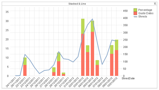
All one chart, 2 expressions set as bars, one as line; the line expression is set on a seperate Axis; in this case Right whilst the 2 stacked are on the left.
Hope that sorts it.
All the best,
Matt - Visual Analytics Ltd
@QlikviewBI
- Mark as New
- Bookmark
- Subscribe
- Mute
- Subscribe to RSS Feed
- Permalink
- Report Inappropriate Content
i have one bar expression and one line expression.
the one bar expression has a second dimension which is type and it automatically stacks them by type. However when i add a line to the graph they automatically change to group.
Any ideas?
- Mark as New
- Bookmark
- Subscribe
- Mute
- Subscribe to RSS Feed
- Permalink
- Report Inappropriate Content
i've the same problem. I need a second dimension for the bar chart. The solution with 2 transparent charts isn't possible for my requirements, because the common dimension is a drilldown group for the time (year - month- week - day) and in case of transparent charts I'll always get different views. I'd need a possibility of synchronisation of the axis of the two charts ...
Any ideas to solve the problem?
Thanks in advance, Reinhold
- Mark as New
- Bookmark
- Subscribe
- Mute
- Subscribe to RSS Feed
- Permalink
- Report Inappropriate Content
Laura,
How many values are there in the second (bar only) Dimension?
If there aren't that many (less than 5 or so) you could work round the issue by synthesising the effect of a second dimension in the actual expression:
Lets say you have the second Dimension called 'Dim' which has 2 values; A and B, instead of adding 'Dim' as a second dimension you'd create an expression for each 'Dim' value eg: sum(if(Dim='A',Sales) and sum(if(Dim='B',Sales); stack those and it will give you the same appearance as if 'Dim' were the second dimension assigned to the bars only.
Using the above and the method I sugested previously should crack it - assuming you don't have 20,000 values in your second dimension.
Hope that sorts it.
Matt - Visual Analytics Ltd
@QlikviewBI
- Mark as New
- Bookmark
- Subscribe
- Mute
- Subscribe to RSS Feed
- Permalink
- Report Inappropriate Content
I've had this kind of need a while ago,
the only way to get something like this working is to create 2 separate graphs using the main with some transparency to see the line chart below as mwoold said.
Otherwise you wont be able to combine a bar chart with dinamic dimension values and a line graph.
You'll need to create a normal combined graph, using the first expression (bar) to calculate the max value of your main expression for the current selection, and then make the expression for the line.
After that you need to create the main stack bar chart, and work on the maximum static axis expression: i've found that the best way to have the same scale as the other graph, this expression for 1,2 if. so in the maximum static you would put: if( max(line_expression)>max(bar_expression), max(Line_expression)*1,2, max(bar_expression)*1.2)
- Mark as New
- Bookmark
- Subscribe
- Mute
- Subscribe to RSS Feed
- Permalink
- Report Inappropriate Content
thank you for the great hint, that solved my problem ...regards, Reinhold