Unlock a world of possibilities! Login now and discover the exclusive benefits awaiting you.
- Qlik Community
- :
- All Forums
- :
- QlikView App Dev
- :
- Re: Stacked chart as a percentage
- Subscribe to RSS Feed
- Mark Topic as New
- Mark Topic as Read
- Float this Topic for Current User
- Bookmark
- Subscribe
- Mute
- Printer Friendly Page
- Mark as New
- Bookmark
- Subscribe
- Mute
- Subscribe to RSS Feed
- Permalink
- Report Inappropriate Content
Stacked chart as a percentage
I have a chart created that give me the breakdown of an order and the quantity filled stacked with what’s not filled.
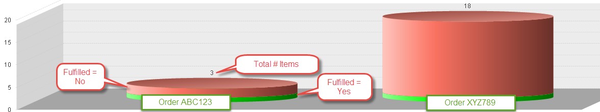
The dimensions are Order(#), a Fulfilled flag (Yes/No) and then an expression of “Count (Distinct Item)”
This gives me a nice view of what’s done and not done – the more done, the better.
I am trying to represent the same stack view as a percentage so each stack is the same relative height (100%) but the percentage would show differently. In the sample above for Order ABC123, the Filled would equate to 33% (Qty 1) versus 66% Not filled (Qty 2) and the other stack would show 5% filled (Qty 1) versus 95% not filled (qty 17) and provide a better representation of how much of each order is done compared to the other.
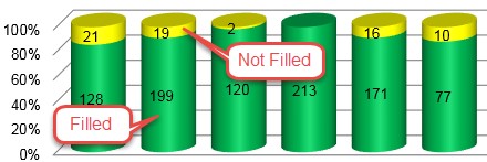
I cannot seem to find a setting in the chart properties to do this or figure out how to make the expression show as a stacked percentage. I had one in Excel that looked like the below
Any assistance is appreciated.
Sample Data is below:
| Order | Fulfilled | Item |
| ABC123 | Yes | ABC |
| ABC123 | No | BCD |
| ABC123 | No | CDE |
| XYZ789 | Yes | EFG |
| XYZ789 | No | FGH |
| XYZ789 | No | GHI |
| XYZ789 | No | HIJ |
| XYZ789 | No | JKL |
| XYZ789 | No | LMN |
| XYZ789 | No | MNO |
| XYZ789 | No | OPQ |
| XYZ789 | No | PQR |
| XYZ789 | No | RST |
| XYZ789 | No | STU |
| XYZ789 | No | TUV |
| XYZ789 | No | UVW |
| XYZ789 | No | VWX |
| XYZ789 | No | XYZ |
| XYZ789 | No | YZA |
| XYZ789 | No | ZAB |
| XYZ789 | No | ZAC |
Accepted Solutions
- Mark as New
- Bookmark
- Subscribe
- Mute
- Subscribe to RSS Feed
- Permalink
- Report Inappropriate Content
- Mark as New
- Bookmark
- Subscribe
- Mute
- Subscribe to RSS Feed
- Permalink
- Report Inappropriate Content
The Excel chart is called the 3-D 100% Stacked Column chart if that helps.
- Mark as New
- Bookmark
- Subscribe
- Mute
- Subscribe to RSS Feed
- Permalink
- Report Inappropriate Content
May be this:
Count(DISTINCT Item)/Count(DISTINCT TOTAL <Order> Item)