Unlock a world of possibilities! Login now and discover the exclusive benefits awaiting you.
- Qlik Community
- :
- All Forums
- :
- QlikView App Dev
- :
- Timeline analysis
- Subscribe to RSS Feed
- Mark Topic as New
- Mark Topic as Read
- Float this Topic for Current User
- Bookmark
- Subscribe
- Mute
- Printer Friendly Page
- Mark as New
- Bookmark
- Subscribe
- Mute
- Subscribe to RSS Feed
- Permalink
- Report Inappropriate Content
Timeline analysis
Hello,
what is the best way to display a timeline in qlikview? For example, I want to display events by the time when they happened. At one time only one thing can happen. Good example of this is timeline of a production development life cycle.
At time t0 : we received requirement
At time t0+ 1hr : developement started
At time t0+ 6hr : product moved to QA
at time t0+12hr : product moved to UAT
at time t0+15hr : product is delivered
You can see attached image for different example as an example done in excel. Now if I try to implement this in bar graphs,I want to display something on Y axis based upon importance of that event.
I know this is possible but what is the best way to do this in qlikview?
Thanks for any reposnse.
Amey
- Mark as New
- Bookmark
- Subscribe
- Mute
- Subscribe to RSS Feed
- Permalink
- Report Inappropriate Content
Maybe this can help you:
- Mark as New
- Bookmark
- Subscribe
- Mute
- Subscribe to RSS Feed
- Permalink
- Report Inappropriate Content
Thanks Dennis. But I'm looking for something slightly different. I don't have time duration between events but just want to see what time which even occured. This analysis in the link shows between time durations which activity happened. Any idea?
- Mark as New
- Bookmark
- Subscribe
- Mute
- Subscribe to RSS Feed
- Permalink
- Report Inappropriate Content
This probably isn't quite what you're looking for, but it's A timeline example. The first chart is durations, but the second chart is just labeled events on a timeline. I suspect the labeling would just overlap if the event names were very long, though. QlikView isn't very clever about moving text around to make it visible.
- Mark as New
- Bookmark
- Subscribe
- Mute
- Subscribe to RSS Feed
- Permalink
- Report Inappropriate Content
This is useful John, thanks.
I’d really like to apply a different colour/symbol for each type of event (with a black line between events) – do you know if this would be possible?
I notice that the second example you provide applies a different colour for each type of event so long as only one case is selected.
Thanks again, Michael.
- Mark as New
- Bookmark
- Subscribe
- Mute
- Subscribe to RSS Feed
- Permalink
- Report Inappropriate Content
Hi.
I’ve added a few lines of data in an attempt to replicate the issues I’m experiencing:
LOAD *
,recno() as IDINLINE [
case,event,RegDate,time
C1,A,17.08.2009 04:00:00,17.08.2009 05:00:00
C1,B,17.08.2009 04:00:00,17.08.2009 05:25:00
C1,C,17.08.2009 04:00:00,17.08.2009 06:00:00
C1,D,17.08.2009 04:00:00,17.08.2009 06:30:00
C1,E,17.08.2009 04:00:00,17.08.2009 09:00:00
C1,F,17.08.2009 04:00:00,17.08.2009 09:47:00
C2,A,17.08.2009 06:00:00,17.08.2009 08:00:00
C2,B,17.08.2009 06:00:00,17.08.2009 09:30:00
C2,C,17.08.2009 06:00:00,17.08.2009 10:00:00
C2,D,17.08.2009 06:00:00,17.08.2009 11:20:00
C2,E,17.08.2009 06:00:00,17.08.2009 11:45:00
C2,F,17.08.2009 06:00:00,17.08.2009 11:59:00
C9,A,17.08.2009 04:00:00,17.08.2009 05:00:00
C9,B,17.08.2009 04:00:00,17.08.2009 05:25:00
C9,A,17.08.2009 04:00:00,17.08.2009 06:00:00
C9,D,17.08.2009 04:00:00,17.08.2009 06:40:00
];
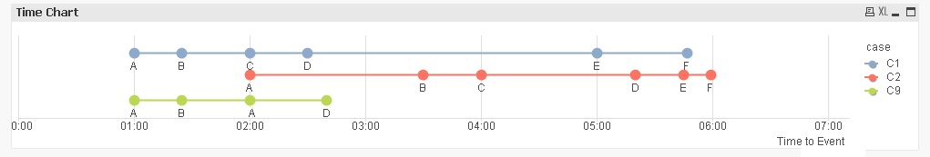
1) Is there a way I can spread the 3 cases evenly along the Y-axis (remove redundant whitespace - see image below)? In my data I have PatientIDs which may be separated by several thousand units.
2) For C9 you will notice event A occurrs twice – so it disappears in the chart, I would really like it to show as follows:
Thanks again, Michael.