Unlock a world of possibilities! Login now and discover the exclusive benefits awaiting you.
- Qlik Community
- :
- All Forums
- :
- QlikView App Dev
- :
- Trend Chart
- Subscribe to RSS Feed
- Mark Topic as New
- Mark Topic as Read
- Float this Topic for Current User
- Bookmark
- Subscribe
- Mute
- Printer Friendly Page
- Mark as New
- Bookmark
- Subscribe
- Mute
- Subscribe to RSS Feed
- Permalink
- Report Inappropriate Content
Trend Chart
Dear Community.
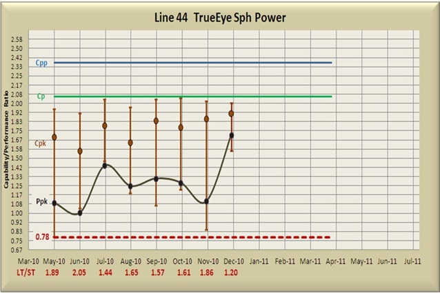
I need to develop the below chart. Can you please let me know how can I proceed for this? How can I get those Vertical Lines?
Thanks a ton in advance
Thanks & Regards
Manideep
- « Previous Replies
-
- 1
- 2
- Next Replies »
Accepted Solutions
- Mark as New
- Bookmark
- Subscribe
- Mute
- Subscribe to RSS Feed
- Permalink
- Report Inappropriate Content
You can add error bars to an expression quite easily.
1) Create the expression
2) Tick the 'has error bars' option
3) If you expand the expression (where you normally set things like text colour) you will now see 3 extra settings for error above, error below and error symmetric. You just need to add in your expressions for the vertical bars in these settings.
Hope that helps
- Mark as New
- Bookmark
- Subscribe
- Mute
- Subscribe to RSS Feed
- Permalink
- Report Inappropriate Content
Hi Manideep,
With the combo chart we can try this report, if you can share me the sample data, I might help you...
Sreeni
- Mark as New
- Bookmark
- Subscribe
- Mute
- Subscribe to RSS Feed
- Permalink
- Report Inappropriate Content
manideep,
You need to analyse the data for this trend chart
--cpp and cp can be implemented by using reference line
--may you should use Off set for expressions
- Mark as New
- Bookmark
- Subscribe
- Mute
- Subscribe to RSS Feed
- Permalink
- Report Inappropriate Content
How Can I take two dimesions (Month and LT/ST) same as above. If I take two dimensions the second one is coming as legend.
- Mark as New
- Bookmark
- Subscribe
- Mute
- Subscribe to RSS Feed
- Permalink
- Report Inappropriate Content
That vertical line chart looks like a box plot. There is a chart wizard to create this
- Mark as New
- Bookmark
- Subscribe
- Mute
- Subscribe to RSS Feed
- Permalink
- Report Inappropriate Content
Looks like a line chart with 4 expressions and a reference line for the '0.78'.
I would suggest that The CpK 'line' has error lines on it to represent the box plot style.
- Mark as New
- Bookmark
- Subscribe
- Mute
- Subscribe to RSS Feed
- Permalink
- Report Inappropriate Content
Hi David Foster,
Your answer is similar to what I need. Here The vertical lines are connecting lines between Max(Cpk) and Min(Cpk) per month. and also How Can I get LT\ST as second dimension under the Month? Can you please help in achieving this?
Thanks & Regards
Manideep
- Mark as New
- Bookmark
- Subscribe
- Mute
- Subscribe to RSS Feed
- Permalink
- Report Inappropriate Content
PFA sample
Vikas
If the issue is solved please mark the answer with Accept as Solution & like it.
If you want to go quickly, go alone. If you want to go far, go together.
- Mark as New
- Bookmark
- Subscribe
- Mute
- Subscribe to RSS Feed
- Permalink
- Report Inappropriate Content
Instead of bars I would like to plot vertical lines that connects between Min values and Max values Per month. How can I do this?
- Mark as New
- Bookmark
- Subscribe
- Mute
- Subscribe to RSS Feed
- Permalink
- Report Inappropriate Content
PFA
Vikas
If the issue is solved please mark the answer with Accept as Solution & like it.
If you want to go quickly, go alone. If you want to go far, go together.
- « Previous Replies
-
- 1
- 2
- Next Replies »