Unlock a world of possibilities! Login now and discover the exclusive benefits awaiting you.
- Qlik Community
- :
- All Forums
- :
- QlikView App Dev
- :
- Variable dimensions
- Subscribe to RSS Feed
- Mark Topic as New
- Mark Topic as Read
- Float this Topic for Current User
- Bookmark
- Subscribe
- Mute
- Printer Friendly Page
- Mark as New
- Bookmark
- Subscribe
- Mute
- Subscribe to RSS Feed
- Permalink
- Report Inappropriate Content
Variable dimensions
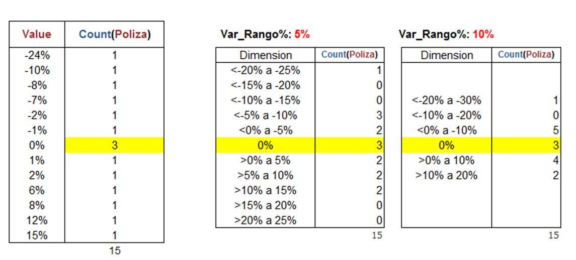
Hi, I need to refine a chart with variable dimensions:
Attach file QV
Thank you so much!
Accepted Solutions
- Mark as New
- Bookmark
- Subscribe
- Mute
- Subscribe to RSS Feed
- Permalink
- Report Inappropriate Content
Hi, Carlos!
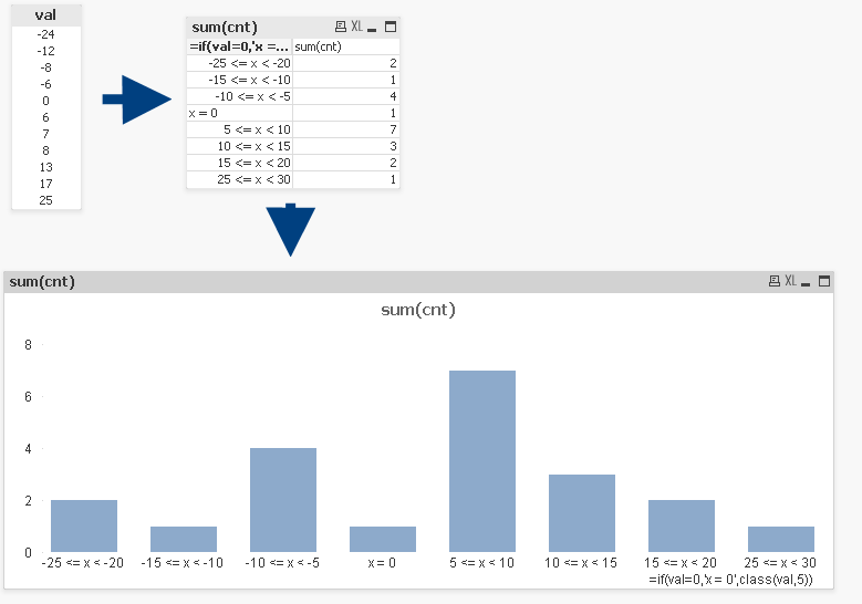
I've tried to use class() function and then create a chart. Works fine:
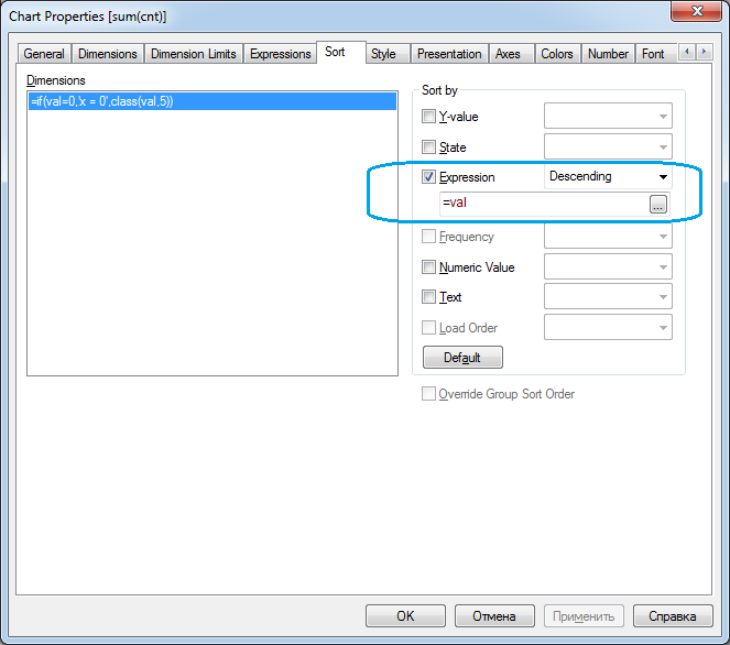
But, if you define your intervals manual try to sort an axis with expression:
Hope you find it usefull!
- Mark as New
- Bookmark
- Subscribe
- Mute
- Subscribe to RSS Feed
- Permalink
- Report Inappropriate Content
Can you elaborate more
- Mark as New
- Bookmark
- Subscribe
- Mute
- Subscribe to RSS Feed
- Permalink
- Report Inappropriate Content
Hi, Carlos!
You can achieve this dimension refining using a Class() function.
It has such syntax class(expression, interval [ , label [ , offset ]]).
In your case it will be "=Class(Value,5)" and "=Class(Value,10)" calculated dimension expression respectively.
You also can use a variable instead of values (five and ten) and let a user to enter it in Input Box.
Hope it helps!
- Mark as New
- Bookmark
- Subscribe
- Mute
- Subscribe to RSS Feed
- Permalink
- Report Inappropriate Content
Hi Carlos,
May be like in attached file
Regards,
Andrey
- Mark as New
- Bookmark
- Subscribe
- Mute
- Subscribe to RSS Feed
- Permalink
- Report Inappropriate Content
Hello,
I can not represent X = 0 in the graph.
The perfect graph would be with X = 0 in the center, with different colors for negative and positive (with a single dimension).
I know I ask a lot !!
Thank you
- Mark as New
- Bookmark
- Subscribe
- Mute
- Subscribe to RSS Feed
- Permalink
- Report Inappropriate Content
Hi, Carlos!
I've tried to use class() function and then create a chart. Works fine:
But, if you define your intervals manual try to sort an axis with expression:
Hope you find it usefull!