Unlock a world of possibilities! Login now and discover the exclusive benefits awaiting you.
- Qlik Community
- :
- All Forums
- :
- QlikView App Dev
- :
- Vertical Alignment of Data Point Labels on Bubble ...
- Subscribe to RSS Feed
- Mark Topic as New
- Mark Topic as Read
- Float this Topic for Current User
- Bookmark
- Subscribe
- Mute
- Printer Friendly Page
- Mark as New
- Bookmark
- Subscribe
- Mute
- Subscribe to RSS Feed
- Permalink
- Report Inappropriate Content
Vertical Alignment of Data Point Labels on Bubble Chart
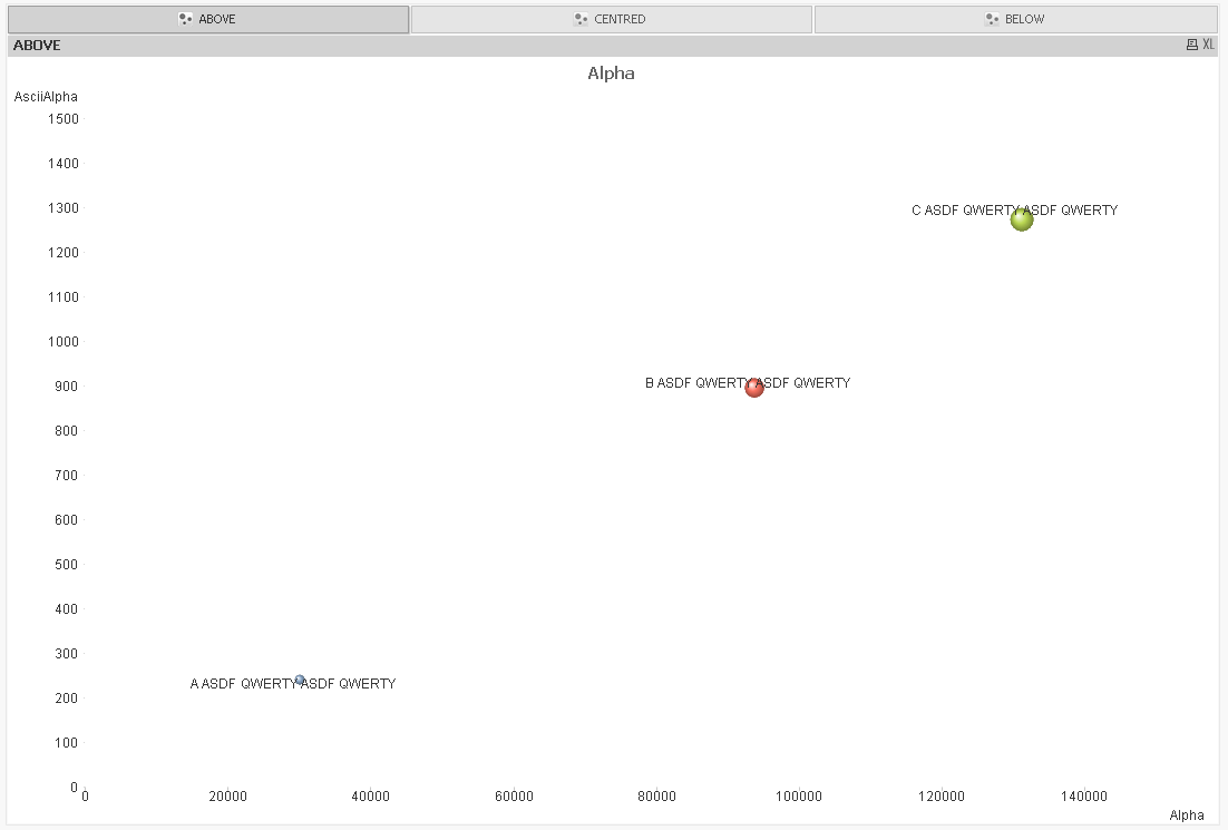
Vertical alignment of labels on bubble charts appears to be very inconsistent when bubble size is variable. This makes the chart very difficult to read when printed in a report.
See below example with vertical alignment of the labels set to "Above". Some of the labels are below the bubbles, some are centred, and some are above. Similar inconsistencies appear with other vertical alignment settings to varying degrees. It makes it very difficult to work out what text relates to what data point when the chart is more crowded, and essentially makes this chart type unusable in printed format, and confusing when used on line.
I have raised with QT, but just thought I'd see if anyone has any ideas, or perhaps I'm missing something?
Ideally the labels could be linked to the data points with a line as is generally the case with other tools I have seen, and then they then wouldn't need to overlap when the chart gets more crowded (which inevitably tends to happen), but for now I would just settle for the alignment working correctly! 
Thanks