Unlock a world of possibilities! Login now and discover the exclusive benefits awaiting you.
- Qlik Community
- :
- All Forums
- :
- QlikView App Dev
- :
- Re: Visualize transfer movement with directed grap...
- Subscribe to RSS Feed
- Mark Topic as New
- Mark Topic as Read
- Float this Topic for Current User
- Bookmark
- Subscribe
- Mute
- Printer Friendly Page
- Mark as New
- Bookmark
- Subscribe
- Mute
- Subscribe to RSS Feed
- Permalink
- Report Inappropriate Content
Visualize transfer movement with directed graph
Hi there!
I am working on QV transfer visualization at the moment but got kind of stuck at the momen
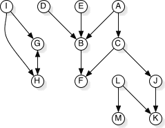
I am trying to achieve to visualiza the movement of goods between various retailers. The best thing would be to generate a directed graph somehow, shown in the picture bellow.
The data set is as follows:
| Order# | RetailerFrom | RetailerTo |
|---|---|---|
| 1 | 10 | 11 |
| 1 | 11 | 12 |
| 2 | 13 | 10 |
| 3 | 15 | 16 |
| 4 | 16 | 10 |
| 4 | 10 | 13 |
It would also be great to differ the size of the bubbles based on count(Order#).
Any ideas how to achieve this?
Thanks in advance!
Andi
- Mark as New
- Bookmark
- Subscribe
- Mute
- Subscribe to RSS Feed
- Permalink
- Report Inappropriate Content
Andreas, were you ever able to solve this? I have exactly the same business problem and am looking for ideas.
I found the Wikipedia articles on:
Directed acyclic graph - Wikipedia, the free encyclopedia
Topological sorting - Wikipedia, the free encyclopedia
But I am not sure if anyone has previously implemented these in QlikView.
- Mark as New
- Bookmark
- Subscribe
- Mute
- Subscribe to RSS Feed
- Permalink
- Report Inappropriate Content
You might try the Neo4J extension from TIQ
http://tiqview.tumblr.com/post/42292909758/graph-data-visualization-in-qlikview
-Rob