Unlock a world of possibilities! Login now and discover the exclusive benefits awaiting you.
- Qlik Community
- :
- All Forums
- :
- QlikView App Dev
- :
- Re: Want to display start and ending month graphic...
- Subscribe to RSS Feed
- Mark Topic as New
- Mark Topic as Read
- Float this Topic for Current User
- Bookmark
- Subscribe
- Mute
- Printer Friendly Page
- Mark as New
- Bookmark
- Subscribe
- Mute
- Subscribe to RSS Feed
- Permalink
- Report Inappropriate Content
Want to display start and ending month graphically like in a Histogram
Hello,
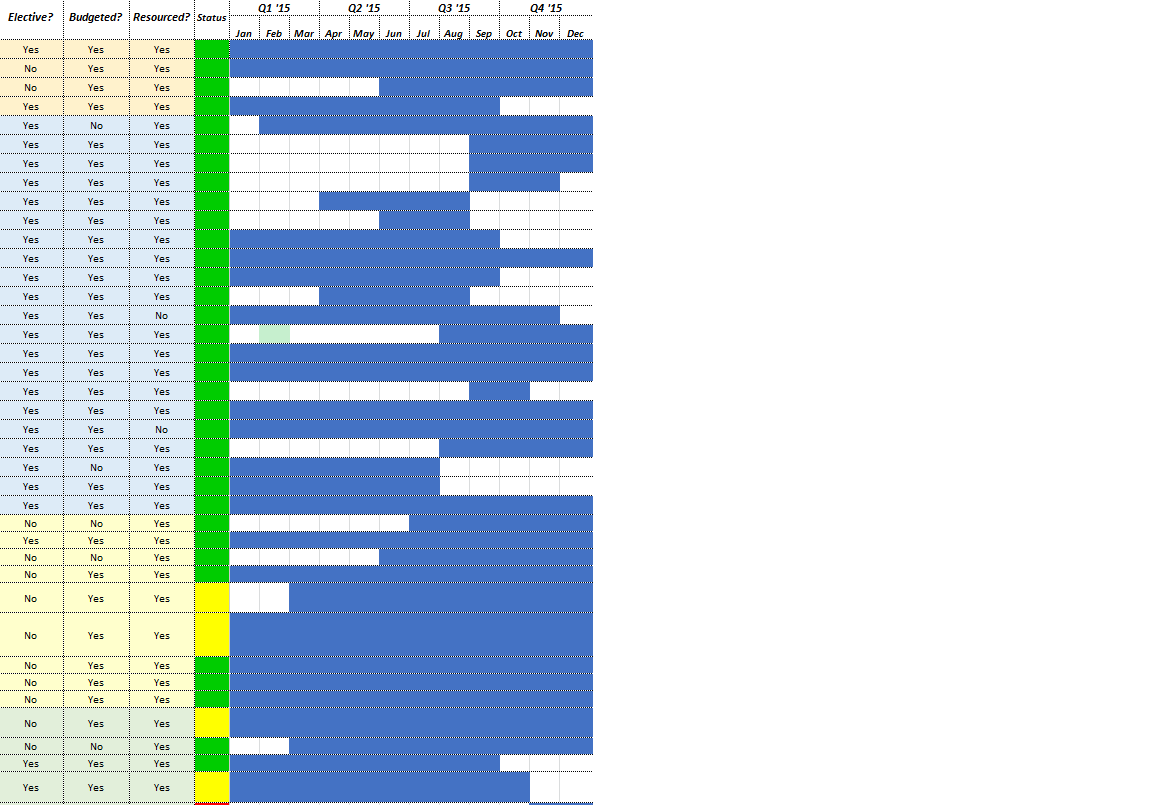
I am brand new to Qlik and have been tasked with recreate in Qlik a project status timeline that currently exists in Excel. The blue time portion in the screenshot below is supposed to represent the ProjectStartDate and the PlannedCompletionDate. I have created a Calendar table but only linked it to the ProjectCompleteDate.
My first guess was to represent this in a Histogram with the undisplayed ProjectName field as a Dimension and the PlannedCompletionDate as an expression, but that is not working. Can someone make any suggestions for doing this or point me to how I can research further how to get this done? It doesn't necessarily have to be a histogram but we want the date range to be displayed graphically.
- Mark as New
- Bookmark
- Subscribe
- Mute
- Subscribe to RSS Feed
- Permalink
- Report Inappropriate Content
Gantt chart might be a good method to search for something like this:
- Mark as New
- Bookmark
- Subscribe
- Mute
- Subscribe to RSS Feed
- Permalink
- Report Inappropriate Content
Thanks for the Gantt chart suggestion Jonathan! I'll give those instructions a try and post an update.