Unlock a world of possibilities! Login now and discover the exclusive benefits awaiting you.
- Qlik Community
- :
- All Forums
- :
- QlikView App Dev
- :
- Re: Waterfall chart
- Subscribe to RSS Feed
- Mark Topic as New
- Mark Topic as Read
- Float this Topic for Current User
- Bookmark
- Subscribe
- Mute
- Printer Friendly Page
- Mark as New
- Bookmark
- Subscribe
- Mute
- Subscribe to RSS Feed
- Permalink
- Report Inappropriate Content
Waterfall chart
Dear Experts:
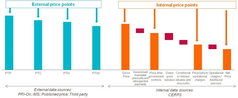
Please note, one of our clients have requested to create a chart in QV like the following, which they call "Waterfall Chart".

I am concerned with the small chunks like "Operational changes/Additional services" or "Direct price reduction" where they start from top position of the right column. I never did anything like this before.
On the other hand the client didn't share any data with us. The data might be something like
| Item | PTP | PTC | PTH | PTW | Gross Price | Gov. Mand. Discount | Price after Gov. Control | Dir. Price Red. | Ind. Rebate | Price b4 op. change | Op. Changes | Net Price |
|---|---|---|---|---|---|---|---|---|---|---|---|---|
| A | 70 | 68 | 67 | 60 | 70 | 5 | 65 | 3 | 2 | 60 | 7 | 53 |
| B | 75 | 60 | 60 | 58 | 75 | 2 | 73 | 5 | 7 | 61 | 2 | 59 |
Seeking your advice.
Ahammad Shafi
Accepted Solutions
- Mark as New
- Bookmark
- Subscribe
- Mute
- Subscribe to RSS Feed
- Permalink
- Report Inappropriate Content
- Mark as New
- Bookmark
- Subscribe
- Mute
- Subscribe to RSS Feed
- Permalink
- Report Inappropriate Content
PFA.
Thanks,
Nimesh
- Mark as New
- Bookmark
- Subscribe
- Mute
- Subscribe to RSS Feed
- Permalink
- Report Inappropriate Content
Shafi,
Can you please post your Application
- Mark as New
- Bookmark
- Subscribe
- Mute
- Subscribe to RSS Feed
- Permalink
- Report Inappropriate Content
Many thanks guys.... Apologies for the delayed reply as I fell sick. The file from Nimesh has answered my question.
Shafi
- Mark as New
- Bookmark
- Subscribe
- Mute
- Subscribe to RSS Feed
- Permalink
- Report Inappropriate Content
Hi Nimesh,
It wasn't clear at first that it was the bar offset in the Expressions that enabled this to work.
Thanks