Unlock a world of possibilities! Login now and discover the exclusive benefits awaiting you.
- Qlik Community
- :
- All Forums
- :
- QlikView App Dev
- :
- What is wrong with my chart as the numbers are WAY...
- Subscribe to RSS Feed
- Mark Topic as New
- Mark Topic as Read
- Float this Topic for Current User
- Bookmark
- Subscribe
- Mute
- Printer Friendly Page
- Mark as New
- Bookmark
- Subscribe
- Mute
- Subscribe to RSS Feed
- Permalink
- Report Inappropriate Content
What is wrong with my chart as the numbers are WAY off
I am try to make a line chart of what is currently a straight chart table.
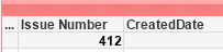
My table shows 412 items and I am attempting to line chart them over time.
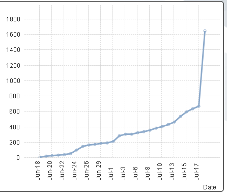
However, when I build the line chart (and turn on full accumulation so I can see the total number of issues), I get a number of 669, and a 'Date = -' field (with over 1600 issues) at the very right of the chart.
The expression I'm using is based on selections and is a simple Count(Variable). How are the numbers from the same exact set of selections so drastically different?
- « Previous Replies
-
- 1
- 2
- Next Replies »
Accepted Solutions
- Mark as New
- Bookmark
- Subscribe
- Mute
- Subscribe to RSS Feed
- Permalink
- Report Inappropriate Content
Do you need a distinct count?
Is the figure correct with count( DISTINCT [Master ID])
- Mark as New
- Bookmark
- Subscribe
- Mute
- Subscribe to RSS Feed
- Permalink
- Report Inappropriate Content
Try checking 'Suppress When Value is Null' on dimension tab of the chart properties and see if that helps.
Best,
Sunny
- Mark as New
- Bookmark
- Subscribe
- Mute
- Subscribe to RSS Feed
- Permalink
- Report Inappropriate Content
Ok, that got rid of my date = - problem, but my final number 669 is still well above the 412 it should be.
When I suppress null, what exactly am I suppressing?
- Mark as New
- Bookmark
- Subscribe
- Mute
- Subscribe to RSS Feed
- Permalink
- Report Inappropriate Content
You are suppressing the Dimension where its Null and I would think that it should suppress the value associated with it as well, but surely that is not happening. Would you be able to share a sample?
Best,
Sunny
- Mark as New
- Bookmark
- Subscribe
- Mute
- Subscribe to RSS Feed
- Permalink
- Report Inappropriate Content
Are the totals for each date correct if accumulation is not enabled?
- Mark as New
- Bookmark
- Subscribe
- Mute
- Subscribe to RSS Feed
- Permalink
- Report Inappropriate Content
Actually, the totals without accumulation are not correct. I singled out a given day, and my straight table chart shows 6, but my line chart shows 10. How do I determine what else the line chart is pulling in as data?
A little more information, I have several different date fields and I have created a linked date calendar in addition to calendars for each type of date (Created, updated, resolved). The date I am using for this particular table chart and line chart is "LDate", or the linked date that pulls anything relevant to a specific date.
- Mark as New
- Bookmark
- Subscribe
- Mute
- Subscribe to RSS Feed
- Permalink
- Report Inappropriate Content
Unfortunately the data is very sensitive and I can't share anything other than what I've already shared.
- Mark as New
- Bookmark
- Subscribe
- Mute
- Subscribe to RSS Feed
- Permalink
- Report Inappropriate Content
We might just need few rows of data which can be representative of your actual data.
- Mark as New
- Bookmark
- Subscribe
- Mute
- Subscribe to RSS Feed
- Permalink
- Report Inappropriate Content
You need to get the values correct before applying accumulate.
Can you add some listboxes to filter the data to help identify why the values are incorrect?
I would suggest cloning the chart and working with a straight table to get the expression correct.
You can add additional dimension fields to the table to see what values Qlik is calculating.
Can you post your expression?
- Mark as New
- Bookmark
- Subscribe
- Mute
- Subscribe to RSS Feed
- Permalink
- Report Inappropriate Content
My expression is simple - "Count(Master ID)".
I should be counting based on the selections. I'll expose every field in list boxes to see if I can see what isn't right.
I just find it odd that one table shows 6, and the chart based on the same data shows 10 for that single date.
- « Previous Replies
-
- 1
- 2
- Next Replies »