Unlock a world of possibilities! Login now and discover the exclusive benefits awaiting you.
- Qlik Community
- :
- All Forums
- :
- QlikView App Dev
- :
- When do households shop? Time of Day and Day of we...
- Subscribe to RSS Feed
- Mark Topic as New
- Mark Topic as Read
- Float this Topic for Current User
- Bookmark
- Subscribe
- Mute
- Printer Friendly Page
- Mark as New
- Bookmark
- Subscribe
- Mute
- Subscribe to RSS Feed
- Permalink
- Report Inappropriate Content
When do households shop? Time of Day and Day of week
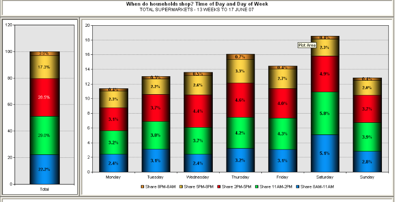
I need to be able to do a graph which shows when households shop i.e. time of day and day of the week like the following graph portrays:

How can this be achieved in Qlikview. I have attached an application with sample data for use. Thanking you in advance.
- Tags:
- new_to_qlikview
- « Previous Replies
-
- 1
- 2
- Next Replies »
Accepted Solutions
- Mark as New
- Bookmark
- Subscribe
- Mute
- Subscribe to RSS Feed
- Permalink
- Report Inappropriate Content
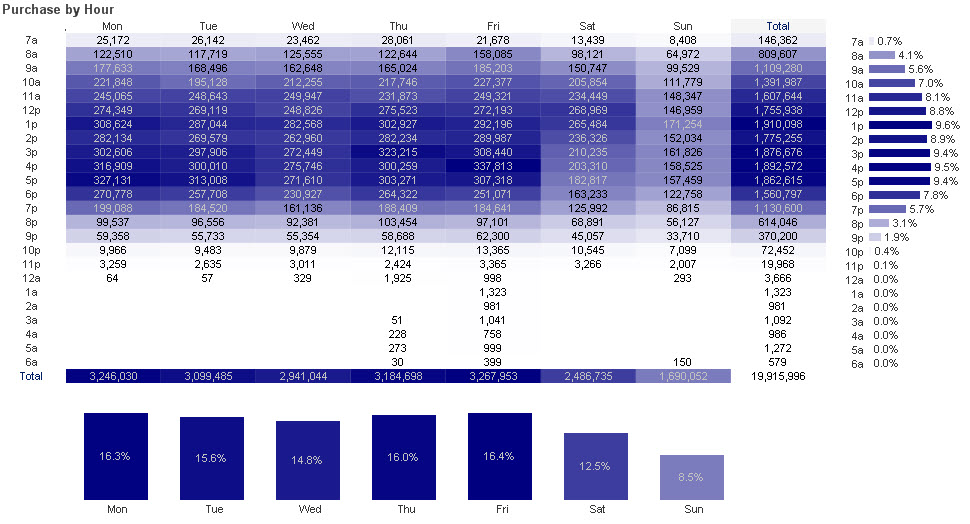
You have some good suggestions here. I've attached a sample qvw that creates the time buckets using mapping. I also experimented with visualizing the data as a heat map. as I think that could make a useful viz.

-Rob
- Mark as New
- Bookmark
- Subscribe
- Mute
- Subscribe to RSS Feed
- Permalink
- Report Inappropriate Content
You don't seem to have time buckets in your data, so you will want to create those in the script based on the transaction time.
Then you can use a stacked bar chart with two dimensions: Weekday and TimeBucket.
As an alternative visualization, you may want to consider doing this a grid:
Pivot Table Grids | Qlikview Cookbook
-Rob
- Mark as New
- Bookmark
- Subscribe
- Mute
- Subscribe to RSS Feed
- Permalink
- Report Inappropriate Content
Hi, Christopher
I need to know which field of your model represents the time to consider.
Eduardo
- Mark as New
- Bookmark
- Subscribe
- Mute
- Subscribe to RSS Feed
- Permalink
- Report Inappropriate Content
Thanks Rob for your input
- Mark as New
- Bookmark
- Subscribe
- Mute
- Subscribe to RSS Feed
- Permalink
- Report Inappropriate Content
Thank you Eduardo for your response.
[Date Dispensed] field has the time stamp for the transaction.
- Mark as New
- Bookmark
- Subscribe
- Mute
- Subscribe to RSS Feed
- Permalink
- Report Inappropriate Content
Hi, Christopher
All data in the [Date Dispensed] field have the same time (12:00:00 AM). This field cannot be used to get the buckets from.
Eduardo
- Mark as New
- Bookmark
- Subscribe
- Mute
- Subscribe to RSS Feed
- Permalink
- Report Inappropriate Content
Thanks Eduardo
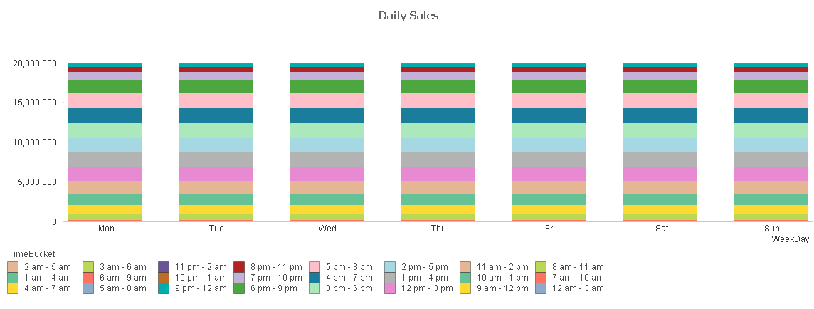
I have managed to do the following:

Please see attached application. However, i have the same values on the Y axis which is wrong. Where am i getting it wrong?
- Mark as New
- Bookmark
- Subscribe
- Mute
- Subscribe to RSS Feed
- Permalink
- Report Inappropriate Content
Hi, Christopher,
Your MasterCalendar table is linked to the [Main Data] table at the month level. As a consequence, every day of your [Main Data] is linked to every weekday (as all weekdays occur in a month).
Change the link between the [Main Data] and the MasterCalendar tables to the date level.
In the [Main Data] create the time buckets, as Rob suggested. After that, you can use both fields as dimensions(weekday and bucket)
Eduardo
- Mark as New
- Bookmark
- Subscribe
- Mute
- Subscribe to RSS Feed
- Permalink
- Report Inappropriate Content
Hi Eduardo
Thank you very much i will do that and advise accordingly.
Regards.
- Mark as New
- Bookmark
- Subscribe
- Mute
- Subscribe to RSS Feed
- Permalink
- Report Inappropriate Content
Hi,
one solution could be:
hope this helps
regards
Marco
- « Previous Replies
-
- 1
- 2
- Next Replies »