Unlock a world of possibilities! Login now and discover the exclusive benefits awaiting you.
- Qlik Community
- :
- All Forums
- :
- QlikView App Dev
- :
- Re: Zoom animation on chart to display small bar c...
- Subscribe to RSS Feed
- Mark Topic as New
- Mark Topic as Read
- Float this Topic for Current User
- Bookmark
- Subscribe
- Mute
- Printer Friendly Page
- Mark as New
- Bookmark
- Subscribe
- Mute
- Subscribe to RSS Feed
- Permalink
- Report Inappropriate Content
Zoom animation on chart to display small bar columns
Hi,
I have a bar chart with a very large y-axis scale, therefore some of my bar columns appear small. I was wondering if it was possible to add a zoom in animation onclick where the y-axis scale re adjusts itself to properly display the small bar columns? I looked into animate under chart properties but didnt find anything of such a thing
Any guidance is appreciated
Thanks,
Cliff
- Mark as New
- Bookmark
- Subscribe
- Mute
- Subscribe to RSS Feed
- Permalink
- Report Inappropriate Content
Hi Cliff, do you find a solution? I have the same problem.
Thanks!
- Mark as New
- Bookmark
- Subscribe
- Mute
- Subscribe to RSS Feed
- Permalink
- Report Inappropriate Content
I created one sample with Qlik as the following, is it your requirement?
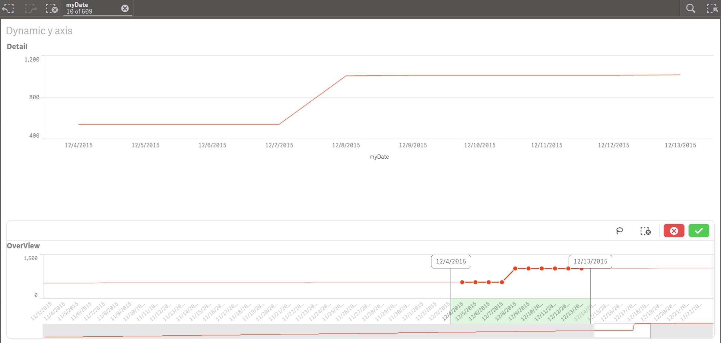
The Detail plot and OverView plot use the same data. We can scroll the green rectangle part to review the overall plot. If we are interested in some specific part, we can select the specific range from OverView plot, and then the Detail plot will show the corresponding selected range in detail and the OverView plot still keeps the same. (we can set the default range for Detail plot as shown in figure1)
figure1:
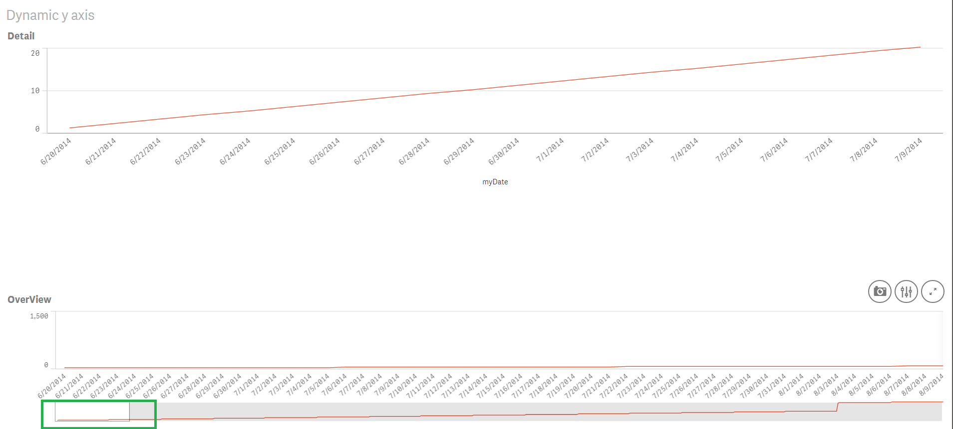
figure2:
- Mark as New
- Bookmark
- Subscribe
- Mute
- Subscribe to RSS Feed
- Permalink
- Report Inappropriate Content
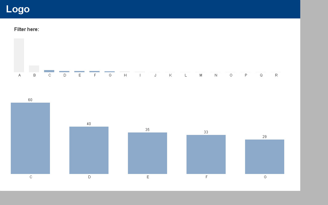
Qlikview don't have animation on graphs like Qliksense. You can also just select the area that you want to see, and it'll be filtered (with a zoom).
Another idea: You can use 2 graphs, one of then will be used to filter, and the second to see the informations. The first needs to be static. Something like the attachment:
- Mark as New
- Bookmark
- Subscribe
- Mute
- Subscribe to RSS Feed
- Permalink
- Report Inappropriate Content
Hi Rodrigo, thanks so much for your help!
As I use Qlik Sense, I can only see how you load data but I can not see your visualization part in Qlik sense.
Could you please provide a screenshot about your visualization and expression script if you also use?
- Mark as New
- Bookmark
- Subscribe
- Mute
- Subscribe to RSS Feed
- Permalink
- Report Inappropriate Content
Hey man, of course I can
At print I've select C, D, E, F and G. I also make a little change comparing the version that I uploaded before.
 ,
,
the expression of the first graph is only: sum( {1} Value )
the expression of the second graph is: sum( Value )
the color expression of the first graph is: if(SubStringCount( Concat(Who,'|'),Who)>0, rgb(140,170,200), rgb(240,240,240))
best regards,
Rodrigo Reis