Unlock a world of possibilities! Login now and discover the exclusive benefits awaiting you.
- Qlik Community
- :
- All Forums
- :
- QlikView App Dev
- :
- about the graphic indicator in the table chart
- Subscribe to RSS Feed
- Mark Topic as New
- Mark Topic as Read
- Float this Topic for Current User
- Bookmark
- Subscribe
- Mute
- Printer Friendly Page
- Mark as New
- Bookmark
- Subscribe
- Mute
- Subscribe to RSS Feed
- Permalink
- Report Inappropriate Content
about the graphic indicator in the table chart
Dear experts,
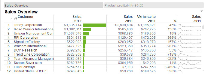
I am a little confused when i saw this picture on the Qlikview for developers. For now I have no idea about how to make it on the sheet.
Could you give me some clue or experience to help me work it out. ~ ![]()
The picture shows as below:
Exactly i mean the left part of the pic which contains the green bars beside the sales column. I couldn't find a same mode in the mini chart ... ![]()

Many thanks and thanks in advance!
br,
Lisen
- « Previous Replies
-
- 1
- 2
- Next Replies »
- Mark as New
- Bookmark
- Subscribe
- Mute
- Subscribe to RSS Feed
- Permalink
- Report Inappropriate Content
Hi,
1. Under Mini Chart option choose linear gauge.

2. Then edit the options in gauge settings as shown in the screenshot.

3. Under Sort Tab, sort it in descending order.
Hope it helps you.
Regards,
Kavita
- Mark as New
- Bookmark
- Subscribe
- Mute
- Subscribe to RSS Feed
- Permalink
- Report Inappropriate Content
Hey Kavita,
In the 2nd Snapshot , what is the Expression you have written and for what field we need to write max() ??
THanks
- Mark as New
- Bookmark
- Subscribe
- Mute
- Subscribe to RSS Feed
- Permalink
- Report Inappropriate Content
It is the expression of the linear gauge.
For reference : It is an Executive dashboard from qlik demos which is the best for UI practice.
Regards,
Kavita
- « Previous Replies
-
- 1
- 2
- Next Replies »