Unlock a world of possibilities! Login now and discover the exclusive benefits awaiting you.
- Qlik Community
- :
- All Forums
- :
- QlikView App Dev
- :
- Re: adding an aggregation bar in a chart
- Subscribe to RSS Feed
- Mark Topic as New
- Mark Topic as Read
- Float this Topic for Current User
- Bookmark
- Subscribe
- Mute
- Printer Friendly Page
- Mark as New
- Bookmark
- Subscribe
- Mute
- Subscribe to RSS Feed
- Permalink
- Report Inappropriate Content
adding an aggregation bar in a chart
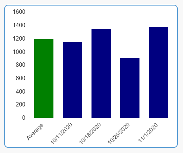
we recently had a requirement to show the aggregation of all results as a bar in a chart. for example if we have weekly values, we plot the sum of the values per week (week will be the dimension). then average the resulting sum and display as the first bar.
we implemented this using a bridge in the script.
does anyone know how this can be done without any additional tables in the DM? just a regular expression in the chart?
- « Previous Replies
-
- 1
- 2
- Next Replies »
Accepted Solutions
- Mark as New
- Bookmark
- Subscribe
- Mute
- Subscribe to RSS Feed
- Permalink
- Report Inappropriate Content
- Mark as New
- Bookmark
- Subscribe
- Mute
- Subscribe to RSS Feed
- Permalink
- Report Inappropriate Content
Island Table with pick(dim,...) should work!
see attached. hope this helps
- Mark as New
- Bookmark
- Subscribe
- Mute
- Subscribe to RSS Feed
- Permalink
- Report Inappropriate Content
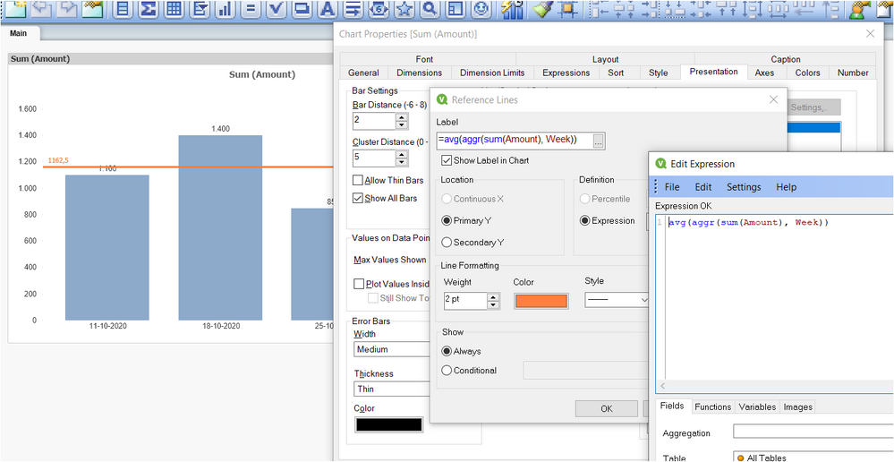
Hi @edwin , you can try this example, that just add a line reference with the average you are looking for.
did it work for you? give like and mark the solution as accepted.
- Mark as New
- Bookmark
- Subscribe
- Mute
- Subscribe to RSS Feed
- Permalink
- Report Inappropriate Content
@Frank_Hartmann we do have a few variations where we add new tables to simulate the extra dimension value (Average). but thanks for the suggestion. what i am looking for is a possible solution without adding a new table.
- Mark as New
- Bookmark
- Subscribe
- Mute
- Subscribe to RSS Feed
- Permalink
- Report Inappropriate Content
@QFabian thanks for the suggestion but that isnt the visual the users specified. yes we can probably convince the user to use that instead but we looked at this as a challenge which we were able to create but i was looking for a simpler solution.
- Mark as New
- Bookmark
- Subscribe
- Mute
- Subscribe to RSS Feed
- Permalink
- Report Inappropriate Content
i was thinking in line of a ValueList combined with the possible weeks, but value list accepts only constants. any ideas?
- Mark as New
- Bookmark
- Subscribe
- Mute
- Subscribe to RSS Feed
- Permalink
- Report Inappropriate Content
Hi @edwin , please try this :
Script :
///your original data
LOAD * INLINE [
Week, Amount
11-10-2020, 1100
18-10-2020, 1400
25-10-2020, 850
1-11-2020, 1300
];
///new record
concatenate
LOAD * INLINE [
Week, Amount
Average, 0
];
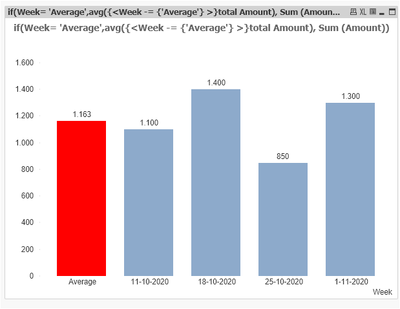
expression : if(Week= 'Average',avg({<Week -= {'Average'} >}total Amount), Sum (Amount))
background color : if(Week= 'Average',lightred())
result :
did it work for you? give like and mark the solution as accepted.
- Mark as New
- Bookmark
- Subscribe
- Mute
- Subscribe to RSS Feed
- Permalink
- Report Inappropriate Content
@QFabian thanks, we do have a few versions similar to what you have done. we are looking for a frontend solution and hoping it might be better.
- Mark as New
- Bookmark
- Subscribe
- Mute
- Subscribe to RSS Feed
- Permalink
- Report Inappropriate Content
You can also use Dimensionality()
see attached qvw. hope this helps
- Mark as New
- Bookmark
- Subscribe
- Mute
- Subscribe to RSS Feed
- Permalink
- Report Inappropriate Content
@Frank_Hartmann That was very interesting. thanks Frank. can you pls explain how using dimensionality introduced a new column (or dimension entry)? also, it looks like you cant sort it so that the aggr is the first bar - but that should not be a deal breaker
- « Previous Replies
-
- 1
- 2
- Next Replies »


