Unlock a world of possibilities! Login now and discover the exclusive benefits awaiting you.
- Qlik Community
- :
- All Forums
- :
- QlikView App Dev
- :
- Re: adding an aggregation bar in a chart
- Subscribe to RSS Feed
- Mark Topic as New
- Mark Topic as Read
- Float this Topic for Current User
- Bookmark
- Subscribe
- Mute
- Printer Friendly Page
- Mark as New
- Bookmark
- Subscribe
- Mute
- Subscribe to RSS Feed
- Permalink
- Report Inappropriate Content
adding an aggregation bar in a chart
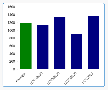
we recently had a requirement to show the aggregation of all results as a bar in a chart. for example if we have weekly values, we plot the sum of the values per week (week will be the dimension). then average the resulting sum and display as the first bar.
we implemented this using a bridge in the script.
does anyone know how this can be done without any additional tables in the DM? just a regular expression in the chart?
- « Previous Replies
-
- 1
- 2
- Next Replies »
- Mark as New
- Bookmark
- Subscribe
- Mute
- Subscribe to RSS Feed
- Permalink
- Report Inappropriate Content
follow on, it appears the limitation of this solution is that you can only add one bar aside from the values of the x dimension - just an observation
- Mark as New
- Bookmark
- Subscribe
- Mute
- Subscribe to RSS Feed
- Permalink
- Report Inappropriate Content
i just saw where the aggr bar is (in the dimension limits tab). thanks
- Mark as New
- Bookmark
- Subscribe
- Mute
- Subscribe to RSS Feed
- Permalink
- Report Inappropriate Content
activating this option gives you the possibility to adress the Totalvalue by using "dimensionality()=0" in the expression. And you are right. You cannot sort the Total. The Total is always on the right side...
- « Previous Replies
-
- 1
- 2
- Next Replies »

