Unlock a world of possibilities! Login now and discover the exclusive benefits awaiting you.
- Qlik Community
- :
- All Forums
- :
- QlikView App Dev
- :
- Re: chart problem
- Subscribe to RSS Feed
- Mark Topic as New
- Mark Topic as Read
- Float this Topic for Current User
- Bookmark
- Subscribe
- Mute
- Printer Friendly Page
- Mark as New
- Bookmark
- Subscribe
- Mute
- Subscribe to RSS Feed
- Permalink
- Report Inappropriate Content
chart problem
I got this chart
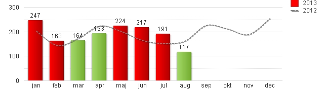
showing amount af items sold in 2012 and 2013, - but items in 2013 consists of two groups ex. carlsberg and tuborg so i´d like the column for jan 2013 to be divided still in one column but with two colors and the amount inside segment.
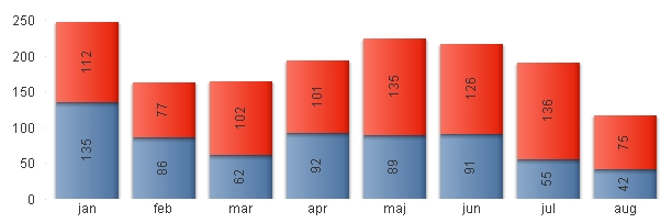
I make this chart with two expressions
=count(if(year='2013',solditems)) and count(if(year='2012',solditems))
I´ve tried to add more dimensions but it fails
I want somthing like this
this is made with 3 dimension and one expression showing 2013 but then i´m missing 2012 as the dotted line?????
- « Previous Replies
-
- 1
- 2
- Next Replies »
- Mark as New
- Bookmark
- Subscribe
- Mute
- Subscribe to RSS Feed
- Permalink
- Report Inappropriate Content
checked for 2013 is BAR and 2012 is checked for LINE
- Mark as New
- Bookmark
- Subscribe
- Mute
- Subscribe to RSS Feed
- Permalink
- Report Inappropriate Content
the subtype ind style tab is greyed out when using two expressions
- Mark as New
- Bookmark
- Subscribe
- Mute
- Subscribe to RSS Feed
- Permalink
- Report Inappropriate Content
Er det ikke bare en stacked barchart?
Men tidsdata præsenteres vel best som vidst med en liniegraph.
Men du burde godt kunne lave en stacked chart. Så årene kommer ovenpå hinanden.. Hvis jeg forstod dig korrekt 
- Mark as New
- Bookmark
- Subscribe
- Mute
- Subscribe to RSS Feed
- Permalink
- Report Inappropriate Content
jo det var - beklager den manglende tilbage melding
- Mark as New
- Bookmark
- Subscribe
- Mute
- Subscribe to RSS Feed
- Permalink
- Report Inappropriate Content
Try this ... this will help u.....
- Mark as New
- Bookmark
- Subscribe
- Mute
- Subscribe to RSS Feed
- Permalink
- Report Inappropriate Content
Only six months too late. 
- « Previous Replies
-
- 1
- 2
- Next Replies »